In today’s digital landscape, responsive typography has become an essential aspect of web design. As Ethan Marcotte popularized the concept of responsive design, the need for adaptable text that enhances user experience across various devices has grown significantly.
This article explores effective CSS techniques for implementing responsive typography, ensuring optimal readability and a strong visual hierarchy.
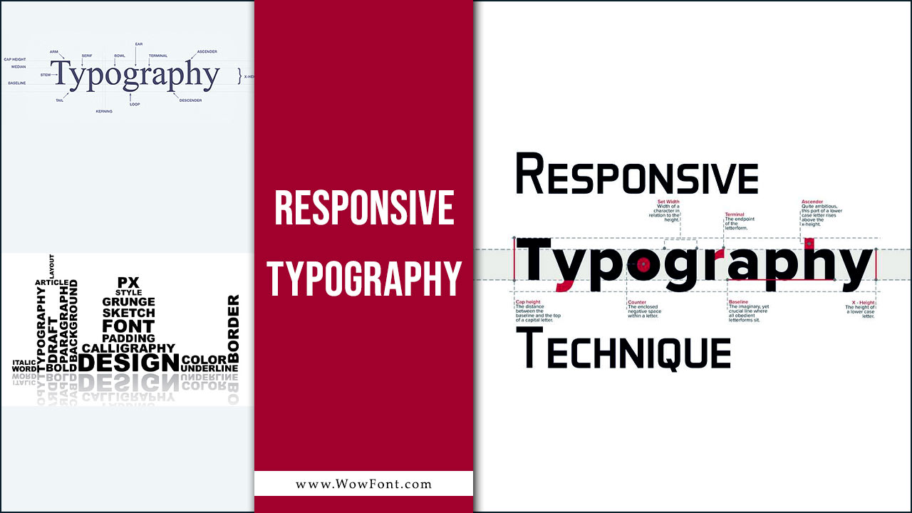
What Does Responsive Typography Mean?
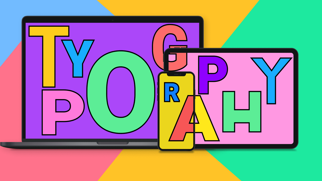
Responsive typography refers to adjusting the text size, heading size, and other typographic elements based on the device and screen width. With the increasing use of mobile devices, designers must focus on viewport-sized typography that remains legible on both small screens and larger displays.
Key Concepts In Responsive Typography

Default Font Size and Base Font Size
Establishing a default font size (often around 16px) sets the foundation for your typography. The base font size can be manipulated using CSS, allowing for flexible adjustments based on the specific breakpoint.
Progressive Enhancement
This principle focuses on building a website that provides a basic experience for all users while enhancing features for those with advanced capabilities. In terms of typography, progressive enhancement means ensuring that your body text is readable on all devices, while web fonts can enhance aesthetics on larger screens.
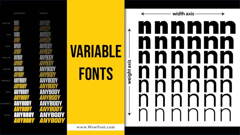
Variable Fonts
These offer a more efficient way to manage typography by allowing multiple styles within a single font file. With variable fonts, designers can dynamically adjust the type size, weight, and other characteristics, ensuring that typography remains flexible across various screen widths.
Modular Scale
A typographic scale helps establish a consistent relationship between font sizes. Using a modular scale, designers can create a harmonious hierarchy of text elements that are proportional to each other, enhancing readability and aesthetics.
Media Queries
These are essential for applying CSS techniques that change the text size and layout based on different screen widths. By utilizing media queries, you can specify styles for various devices, ensuring that your typography is responsive.
Implementing Responsive Typography
To create an effective, responsive typography system, consider the following strategies:
Responsive Font Sizes
Use CSS properties like calc() to create flexible font sizes that adapt to the viewport. For example:
body {

font-size: calc(1em + 1vw);

}
This technique allows the minimum font size to be defined while also scaling based on the viewport size.
Using Rem Units
When defining text size, using Rem Units ensures that typography scales relative to the root element, allowing for more accessible designs. For instance:
h1 {

font-size: 3rem; // Responsive heading size

}
Establishing A Typographic Scale
Create a clear hierarchy in your design by defining sizes for headings, subheadings, and body text. A sample scale might look like this:
h1 {

font-size: 2.5rem;

}

h2 {

font-size: 2rem;

}

p {

font-size: 1rem;

}
Vertical Rhythm
Maintain consistent spacing between lines and paragraphs to enhance readability. Using a consistent line height that scales with your font sizes will create a better reading experience across devices.
Testing And Adjustments
Regularly test your typography across different devices to ensure that it maintains good readability and usability. Adjust your text elements as needed to achieve the best user experience.
Conclusion
Responsive typography is an integral part of responsive web design. By focusing on good typography practices—such as using a modular scale, relative units like rem, and media queries—you can enhance readability and improve the overall user experience. Adapting your typography based on device characteristics not only ensures legibility but also elevates the aesthetic quality of your web projects.
FAQs
1.Why Is A Modular Scale Important?
A modular scale creates a consistent relationship between font sizes, enhancing visual hierarchy and design flow.
2.What Are Rem Units?
Rem units are relative to the root font size, making them more flexible for responsive design compared to fixed pixel sizes.
3.What Is The Ideal Body Text Size For Readability?
A body text size of 16px to 18px is generally recommended for optimal readability on most devices.
4.What Role Do Media Queries Play In Responsive Typography?
Media queries apply specific styles at different breakpoints, ensuring that typography adapts to various screen sizes.
5.What Is Vertical Rhythm In Typography?
Vertical rhythm maintains consistent spacing between lines and elements to enhance readability and visual coherence.
Leave a Comment