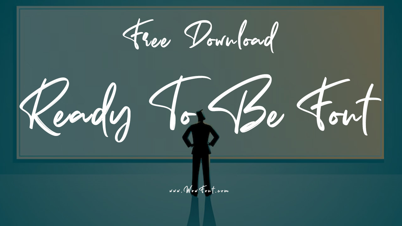
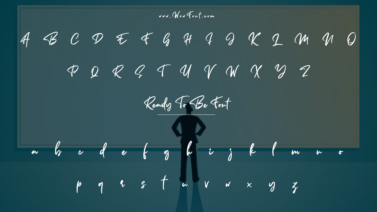
The Ready To Be font is a modern and elegant typeface used in the title of Twice’s twelfth extended play, Ready To Be. Designed by Tan Type, the font is a web-ready font that brings a fresh and stylish vibe to the music artwork.
With its bold statement and clean lines, the font makes it an ideal choice for headings, logos, and posters. Whether you’re designing printed materials or online content, Sometimes, the font used in the EP’s title, offers a high degree of readability and elegance.

Ready To Be Font Details:

- Font Family: Sometimes by Tan Type
- Styles: Available in different font styles, including regular, bold, and italic for various typographic needs.
- Web-Ready Font: Perfect for graphic design projects, web design, and any digital or printed format.
- Font Size: Ideal for both small sizes and large headings, providing versatility for various design projects.
This display font offers an engaging style, making it a strong font choice for everything from branding to album artwork. It works well in logos, headings, and posters, thanks to its bold statement and modern aesthetic.
Font Pairing And Usage Tips:
When incorporating the Ready To Be font into your projects, consider pairing it with fonts like Trebuchet MS or Times New Roman for body text, as these serif fonts provide great readability while maintaining a clean and professional style.
- Pairing with sans-serif fonts: Combine Sometimes with sans-serif fonts like Helvetica or Arial for balance and clarity in designs.
- Best for display: Use the Ready To Be font for headlines, posters, signage, and logos, where its impact can shine.
- Web & Printed Designs: The font package is versatile for both web design and printed materials.
The Sometimes font is also web ready, making it an excellent choice for online designs. It ensures consistency across browsers and delivers great legibility, even at smaller sizes.
Conclusion
The Ready To Be font by Tan Type is a bold, modern choice perfect for headlines, logos, and graphic design projects. Its clean lines and stylish look make it ideal for both print and web use. Pair it with sans-serif fonts for balance and consistency. Whether you’re working on branding, posters, or album covers, this versatile font adds elegance and impact to your designs.
FAQs
1.What Font Is Used In The Ready To Be EP Title?
The title uses the Sometimes font by Tan Type, a modern and elegant display font.
2.Can I Use The Ready To Be Font In My Design Projects?
Yes, you can use the Sometimes font for graphic design, logos, posters, and other design materials, following the font’s license agreement.
3.What Are Some Similar Fonts To The Ready To Be Font?
Times New Roman, Trebuchet MS, and Helvetica are some similar fonts that offer clean lines and high readability for body text.
4.Where Can I Download The Sometimes Font?
The Sometimes font is available for purchase from CreativeMarket. A demo version is also available for personal use.
5.How Can I Use The Ready To Be Font In Web Design?
The Ready To Be font is web-ready, meaning you can easily use it for website headers, content, and signage. It’s compatible with Google Fonts and other web font services.


Leave a Comment