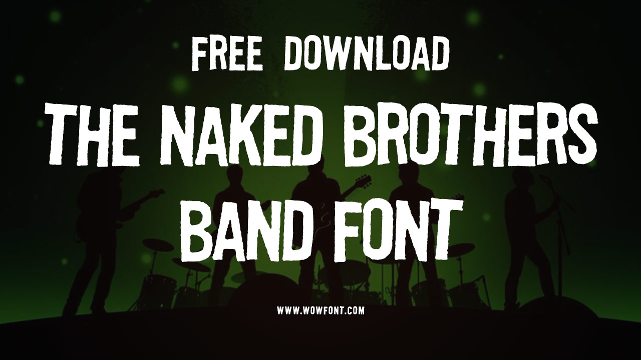
The Naked Brothers Band font, primarily based on the Flyer Hardcore typeface, was created by House Industries. This distinctive font captures the youthful energy and musical spirit of the band, which starred Alex Wolff and was developed by Polly Draper. The show’s catchy tunes and themes resonate with a young audience, offering a unique identity within the realm of American television.

The Naked Brothers Band Font Is Actually Flyer Hardcore

The Naked Brothers Band explored themes relevant to young men and women, including friendship, love, and the challenges of growing up. It resonated with millions of viewers, reflecting real-world events and personal journeys. The show highlighted the importance of music as a form of worship and expression, addressing complex ideas such as death and identity in a way that was relatable to young audiences in places like New York and California.
Font Family And Styles
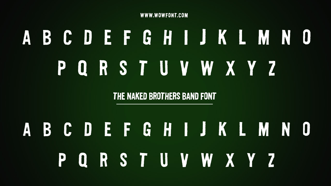
The Naked Brothers Band font, derived from Flyer Hardcore, belongs to the display typeface family. It features bold, edgy styles that evoke a punk rock aesthetic, fitting perfectly with the band’s image. The typeface is characterized by its:
- Bold Lettering: Perfect for titles and logos.
- Unique Characters: Features a variety of manipulated letters that enhance its distinctive look.
Designer Name
The font was designed by House Industries, a renowned name in the type design industry. Their work on Flyer Hardcore includes a collection of fonts inspired by punk rock band logos, making it an ideal choice for the show.
Pairing Options
When considering how to use the Naked Brothers Band font, pairing it with complementary typefaces is essential. Here are some recommended pairings:
- Sans Serif Fonts: Pair with fonts like Helvetica or Futura for a clean contrast.
- Script Fonts: Combine with playful script fonts to soften the boldness for promotional materials.
- Geometric Fonts: Use geometric typefaces to maintain a modern look while allowing the font’s character to stand out.
Similar Fonts
If you’re looking for alternatives or similar fonts, consider:
- Punk’s Not Dead: Captures a similar vibe with a grungy style.
- Caveat Brush: Offers a more hand-drawn feel while still being bold.
- Blacker Pro: A slab serif that maintains a strong presence, suitable for varied uses.
Where To Use The Font
The Naked Brothers Band font is versatile and can be effectively used in various contexts, including:
- Event Posters: Great for music events or festivals targeting young audiences.
- Merchandise: Ideal for T-shirts, hats, and other apparel for fans.
- Social Media Graphics: Perfect for eye-catching posts that need to stand out.
- Album Covers: Fits well for music albums or promotional materials for emerging artists.
Conclusion
The Naked Brothers Band font not only reflects the essence of the band but also serves as a powerful tool for expressing creativity in various design contexts. Its unique characteristics make it a favorite among designers aiming to evoke a sense of youth and vitality.
FAQs
1.What Is The Naked Brothers Band Font?
The Naked Brothers Band font is based on Flyer Hardcore by House Industries, featuring a punk rock aesthetic.
2.Who Designed The Naked Brothers Band Font?
It was designed by House Industries, known for their unique and creative typefaces.
3.What Are Some Good Pairings For The Naked Brothers Band Font?
It pairs well with sans serif fonts like Helvetica, playful scripts, and geometric typefaces.
4.Where Can I Use The Naked Brothers Band Font?
You can use it in event posters, merchandise, social media graphics, and album covers.
5.Are There Similar Fonts To The Naked Brothers Band Font?
Yes, similar fonts include Punk’s Not Dead, Caveat Brush, and Blacker Pro.


Leave a Comment