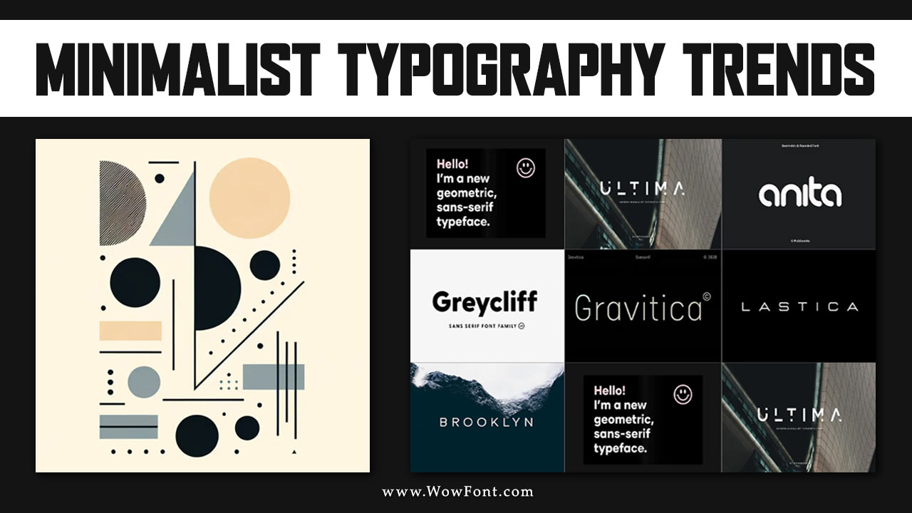
As design continues to evolve, minimalist typography is making a significant impact on how we communicate visually. This trend emphasizes simplicity and clarity, emphasizing essential elements enhancing readability and aesthetic appeal. In 2024, minimalist typography trends are shaping digital and print design landscape, providing a foundation for effective communication.
Minimalist typography strips away unnecessary embellishments, allowing the content to shine. This style relies on clear letterforms, effective use of white space, and a limited color palette, ensuring that every element serves a purpose. Whether through sans serif fonts or elegantly crafted serif typefaces, minimalist typography encourages designers to embrace the “less is more” philosophy.

Key Features of Minimalist Typography:
- Clarity: Prioritizing legibility across various platforms, from web design to printed materials.
- Simplicity: Using basic shapes and forms to create impactful designs.
- Focus: Ensuring the viewer’s attention is directed toward the message, not the embellishments.
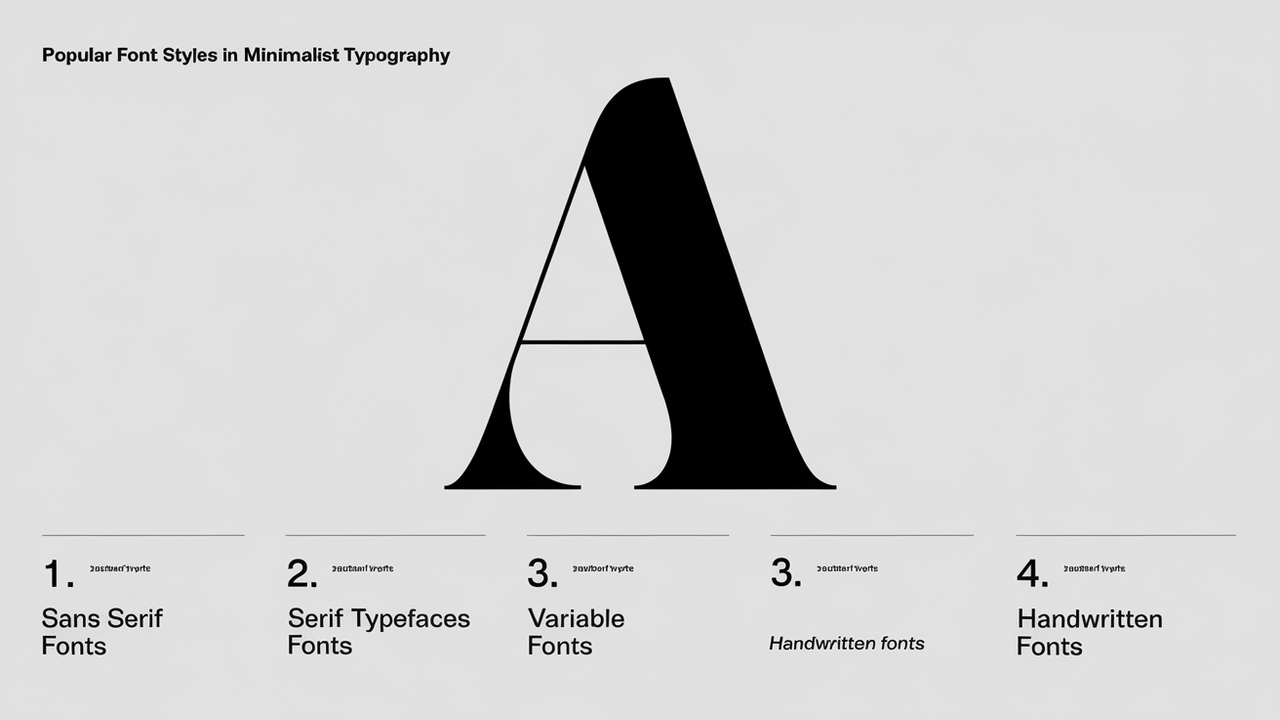
Popular Font Styles In Minimalist Typography

As we look toward the future, web design trends will continue to favor minimalist typography. Clean layouts, large fonts, and effective use of white space will remain essential in creating engaging user experiences. Embracing minimalist design principles will ensure that typography plays a crucial role in effective communication.
-
Sans Serif Fonts
Sans serif fonts are essential in minimalist design due to their clean lines and modern appeal. Popular options like Helvetica, Arial, and Futura are timeless examples that maintain clarity and simplicity, making them ideal for web design trends and print design.
-
Serif Typefaces
While serif fonts are often perceived as traditional, minimalist designs can effectively incorporate them. Fonts like Georgia and Merriweather offer a sophisticated touch without sacrificing readability. These modern serif typefaces strike a perfect balance in editorial design, enhancing visual interest while adhering to minimalist principles.
-
Variable Fonts
Variable fonts are gaining traction in minimalist typography, allowing designers to adjust weight and style without losing clarity. Roboto Flex and Inter are excellent examples, offering flexibility that’s ideal for responsive designs, adapting seamlessly across devices while adhering to the latest typography trends.
-
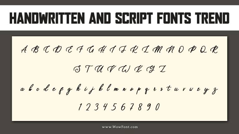
Handwritten Fonts
While seemingly counterintuitive, handwritten fonts can be minimalist when used judiciously. Fonts like Dancing Script and Patrick Hand provide a personal touch while maintaining a clean aesthetic. When kept simple, these custom fonts add a unique flair to minimalist layouts.
-
Bold Typography
Bold typography can create striking focal points within a minimalist layout. Using bold fonts like Montserrat Bold or Oswald for headings helps emphasize important information without overwhelming the design. This approach ensures readability while adhering to minimalist design principles.
The Role Of Font Pairings
Successful font pairings are essential in minimalist typography. Combining a sans serif font for body text with a bold serif for headings can create a harmonious balance. This technique enhances readability while maintaining visual interest.
Example Pairings:
- Montserrat (body) + Playfair Display (headings)
- Roboto (body) + Merriweather (headings)
Exploring Experimental Typography
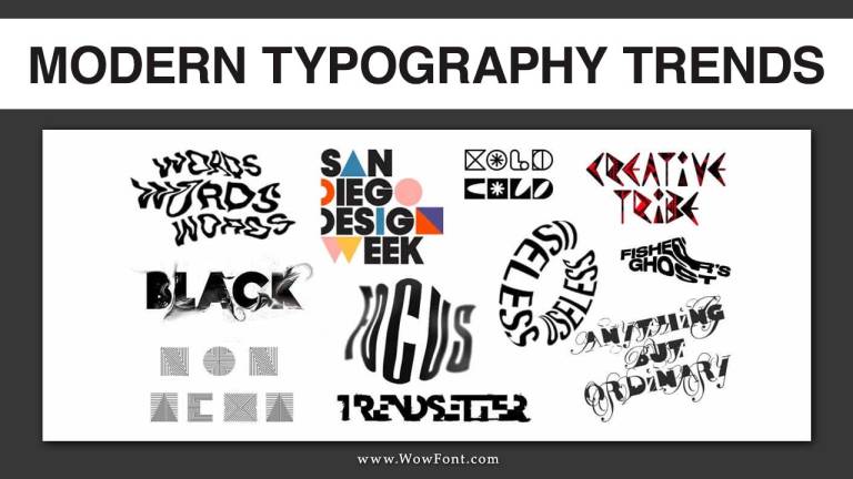
Incorporating experimental typography into minimalist designs adds depth without clutter. Using outlined fonts or kinetic typography can introduce movement and engagement, making the design dynamic while adhering to minimalist principles.
The Impact Of Minimalism On Readability
One of the primary benefits of minimalist typography is improved readability. By eliminating distractions and focusing on the essential elements, designers create a more enjoyable reading experience. This is especially important in today’s fast-paced digital world, where attention spans are shorter than ever.
Conclusion
Minimalist typography is not just a passing trend; it’s a fundamental shift in how we approach design. Designers can create powerful visual narratives by focusing on clarity, simplicity, and effectiveness. As 2024 unfolds, embracing these minimalist typography trends will be key to staying ahead in the ever-evolving design world.
FAQs
1.What Is Minimalist Typography?
Minimalist typography focuses on simplicity and clarity, using clean lines and essential elements to enhance readability.
2.Which Fonts Are Best For Minimalist Designs?
Popular choices include sans serif fonts like Helvetica and Arial, serif typefaces like Georgia, and variable fonts for flexibility.
3.How Do Font Pairings Work In Minimalist Design?
Font pairings involve combining different fonts to create balance and visual interest while maintaining clarity.
4.What Role Does Readability Play In Minimalist Typography?
Readability is crucial in minimalist typography, ensuring that the message is easily understood without distractions.
5.Can Handwritten Fonts Be Used In Minimalist Design?
Yes, handwritten fonts can add a personal touch to minimalist designs when used sparingly and kept simple.


Leave a Comment