Typography is the art and technique of arranging typefaces to make written language readable and visually appealing. Over the years, many iconic fonts have become synonymous with specific industries and trends. Here’s a breakdown of some of the most influential fonts in graphic design and UI design, covering both serif and sans serif typefaces.
![]()
Times New Roman And Serif Classics
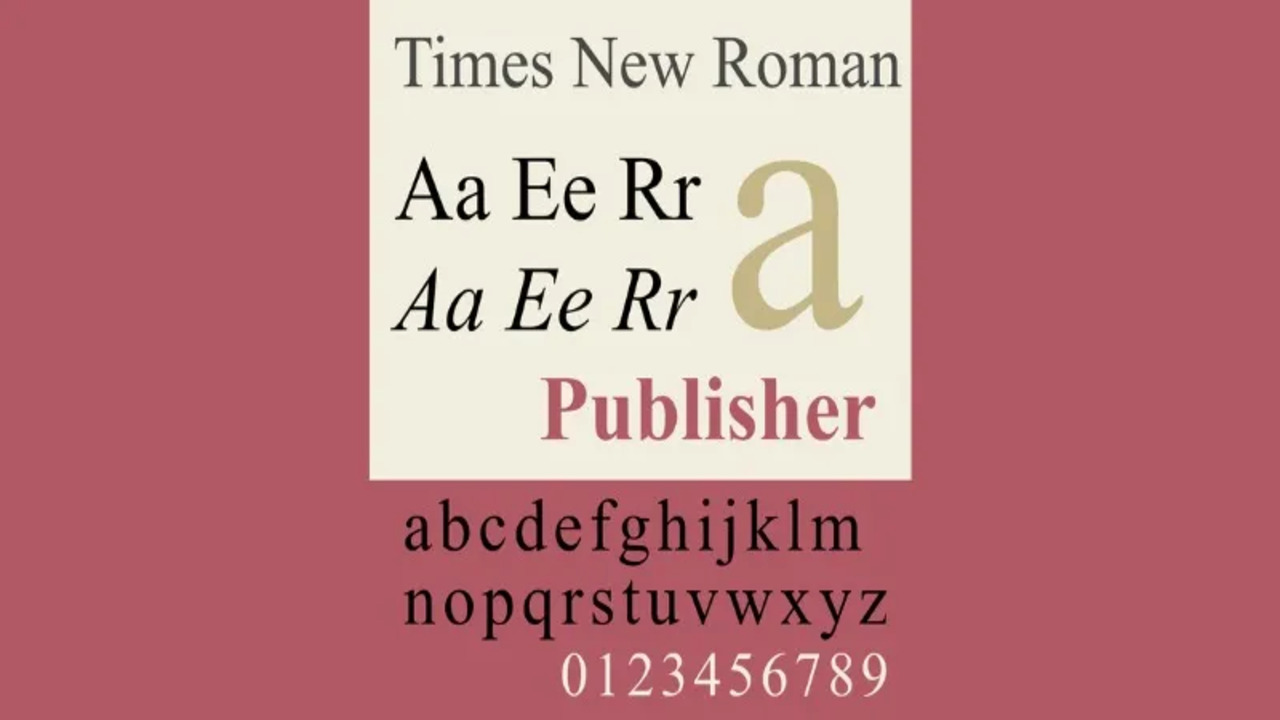
Times New Roman is one of the most recognized serif fonts, often used in body text. Its timeless design makes it a classic font for formal writing. Other serif fonts like Playfair Display, Adobe Garamond, and Garamond typeface—named after Claude Garamond—are widely used for their elegance and readability. The Bodoni typeface, designed by Giambattista Bodoni, is another popular choice for luxury branding, known for its thick and thin contrasts in strokes.
Times New Roman
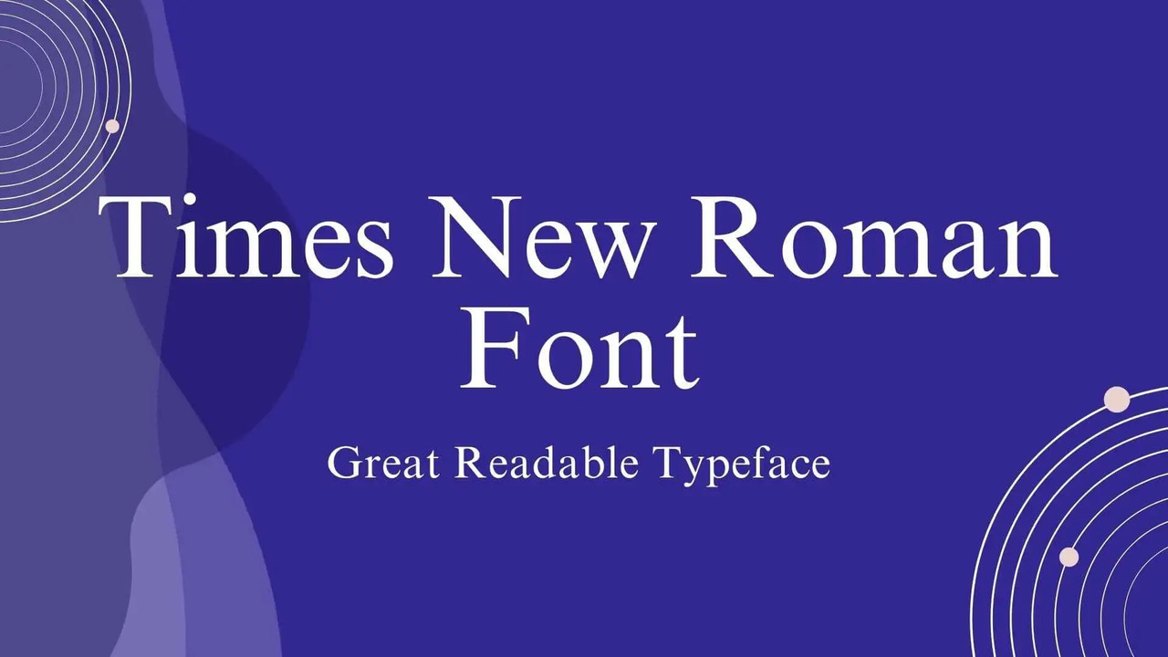
Category: Serif Font
Designed by Stanley Morison and Victor Lardent for The Times in 1931, Times New Roman is one of the most popular serif fonts. Its classic style is perfect for print media, especially newspapers and books, providing an air of authority and tradition.
Pros:
- Excellent readability in print.
- Formal and professional appearance.
- Widely available across platforms.
Georgia
Category: Serif Font
Designed by Matthew Carter in 1993, Georgia was specifically created for screen readability. Its larger x-height and open letterforms make it a favorite for web design, offering a classic serif typeface that is easily read on digital devices.
Pros:
- High legibility at small sizes.
- Suitable for both print and web.
- Classic look with modern usability.
Garamond
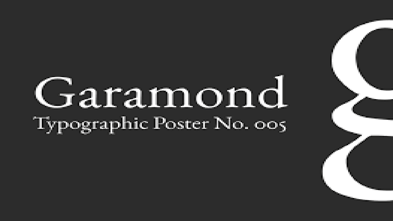
Category: Serif Font
The Garamond typeface has a rich history, tracing back to Claude Garamond in the 16th century. Known for its elegance and readability, it is a popular choice for books and long-form texts, lending a classic touch to any design.
Pros:
- Timeless and sophisticated appearance.
- Excellent for body text in print.
- Various adaptations available (e.g., Adobe Garamond).
Baskerville
Category: Serif Font
Designed by John Baskerville in the 1750s, this serif typeface is celebrated for its increased contrast and sharp serifs. It combines elegance and readability, making it popular for formal documents and literary works.
Pros:
- High contrast improves visual impact.
- Suitable for headlines and body text.
- Classic and refined style.
Bodoni
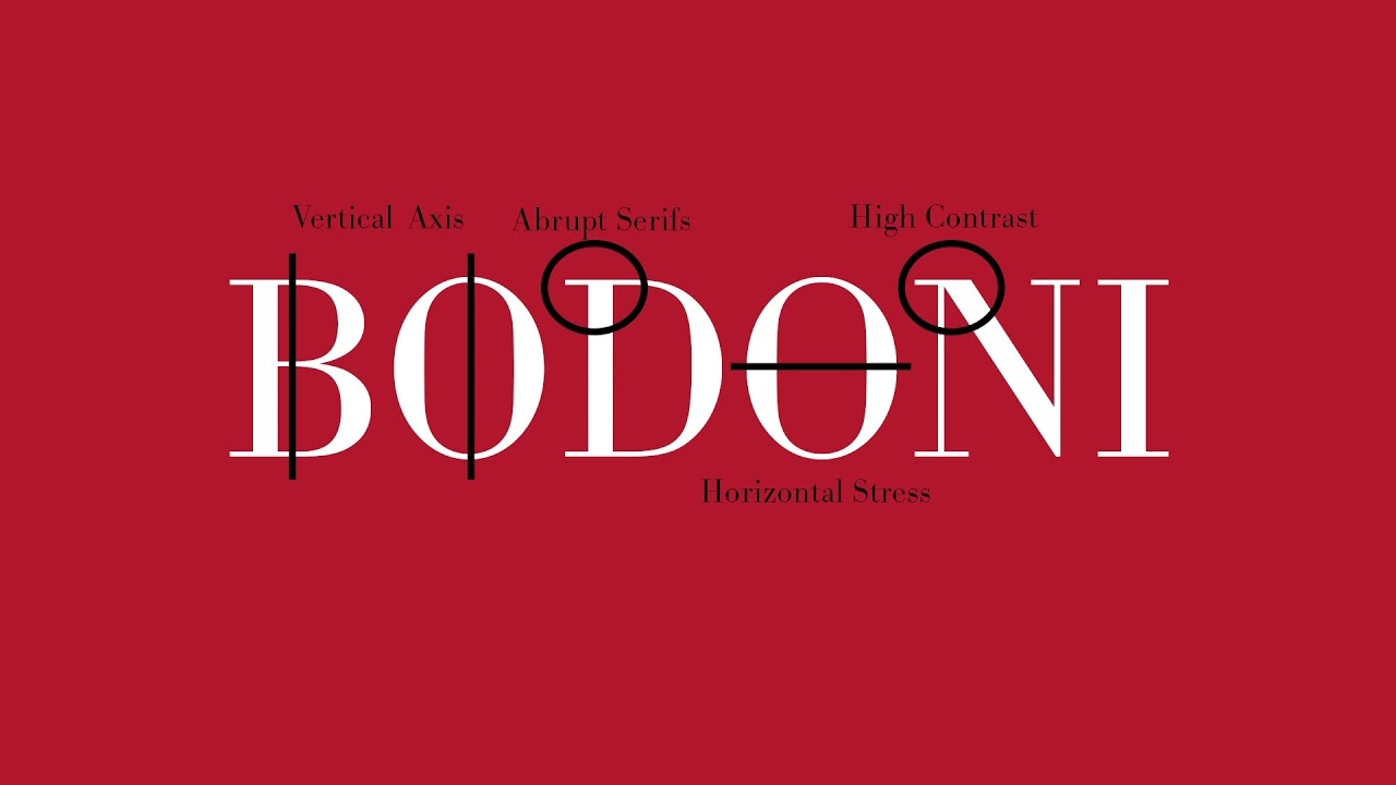
Category: Serif Font
Designed by Giambattista Bodoni in the late 18th century, this serif typeface is characterized by its dramatic contrast between thick and thin strokes. Bodoni is often used in fashion magazines and luxury branding for its stylish and sophisticated appearance.
Pros:
- High contrast enhances visual appeal.
- Excellent for headlines and display text.
- Elegant and stylish design.
Rockwell
Category: Slab Serif Font
Rockwell, created by Franklin Gothic’s designer, is a slab serif font known for its bold and robust characteristics. Its geometric shapes make it ideal for impactful headlines and advertising, providing a sense of strength.
Pros:
- Strong presence, perfect for titles.
- Versatile across various media.
- Bold and distinctive style.
The Evolution Of Sans Serif Fonts
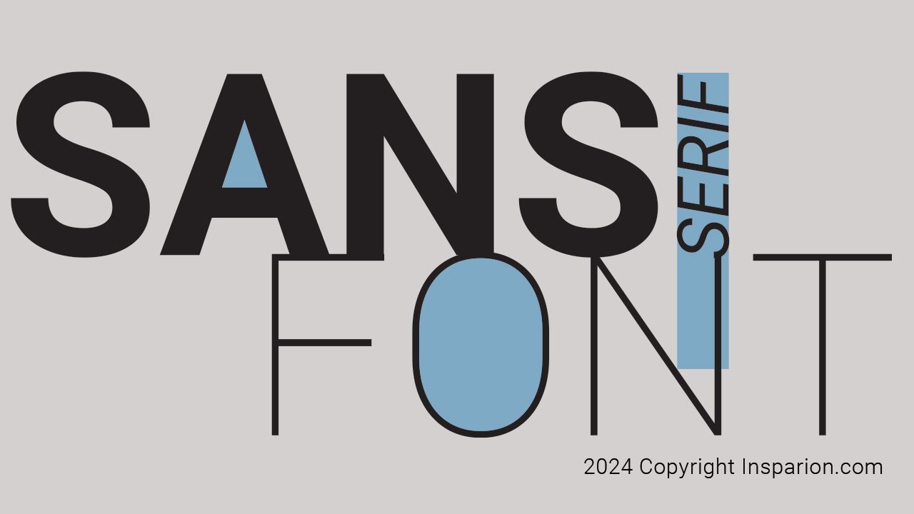
Sans serif fonts have taken the lead in modern design, especially in logo design and web fonts. Akzidenz Grotesk, designed in the 19th century, paved the way for modern sans serifs like Neue Haas Grotesk (later known as Helvetica) by Eduard Hoffmann and Adrian Frutiger.
Other notable sans serif typefaces include Roboto, Lucida Sans, Proxima Nova, News Gothic, Trade Gothic, and Franklin Gothic. All of them are perfect for extensive UI design and graphic design projects. Century Gothic, a geometric sans, is another favorite for its clean, minimalist look.
Helvetica
Category: Sans Serif Font
Helvetica is arguably one of the most recognizable fonts globally. Designed by Max Miedinger in 1957, this geometric sans serif font is synonymous with modernist design and has been widely adopted in corporate branding, signage, and advertising. Its clean lines and versatility make it a go-to choice for many designers.
Pros:
- Timeless and modern appearance.
- Highly legible in various sizes.
- Versatile for both print and digital use.
Roboto
Category: Sans Serif Font
Created by Christian Robertson for Google, Roboto has become a staple in UI design and web applications. This modern sans serif font combines a friendly and approachable aesthetic with mechanical forms, making it suitable for both headings and body text.
Pros:
- Optimized for digital use and readability.
- Wide range of weights and styles.
- Open-source and free to use.
Verdana
Category: Sans Serif Font
Designed by Matthew Carter for Microsoft in 1996, Verdana was specifically created for screen use. Its wide spacing and tall lowercase letters enhance legibility, making it a favorite for web designers.
Pros:
- Exceptional readability on screens.
- Wide character spacing reduces crowding.
- Strong performance in body text.
Arial
Category: Sans Serif Font
Arial, developed by Robin Nicholas and Patricia Saunders in 1982, is a versatile sans serif font often used in digital and print media. While sometimes seen as a Helvetica alternative, its rounded shapes give it a softer appearance.
Pros:
- Widely available and compatible across platforms.
- Clean and modern design.
- Good legibility at various sizes.
Futura
Category: Geometric Sans Serif Font
Futura, created by Paul Renner in 1927, is a geometric sans serif typeface that epitomizes modernism. Its clean lines and circular forms have made it a favorite in logo design, advertising, and various design projects.
Pros:
- Strong geometric shapes convey modernity.
- Excellent for headlines and branding.
- Versatile with various weights.
Decorative And Script Fonts
Script and decorative fonts add flair to designs. While Comic Sans is often ridiculed in the design community, it remains widely recognized. Script fonts like New York and custom fonts tailored for specific brands provide a human touch to digital interfaces. In type design, Hermann Zapf was famous for combining decorative and script elements, creating fonts that are still used today.
Comic Sans
Category: Sans Serif Font
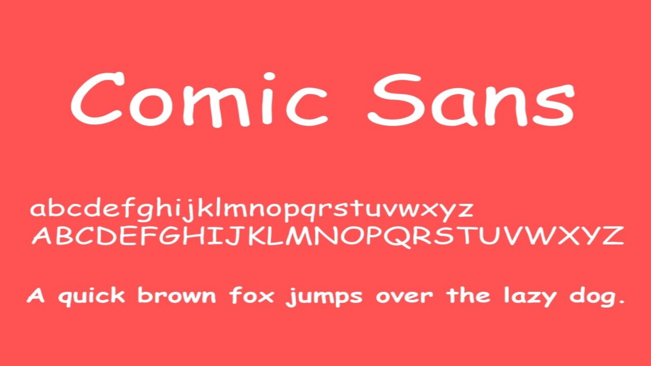
Despite its controversial status, Comic Sans, designed by Vincent Connare in 1995, has become one of the most recognizable fonts. Initially created for children’s software, its playful, informal style has led to its use in various casual contexts, often humorously.
Pros:
- Fun and approachable aesthetic.
- Good for informal communication.
- Engages younger audiences.
Fonts In Branding And Logo Design
Logo fonts are crucial for brand identity. Trade Gothic and News Gothic have been used in corporate logo design, while Proxima Nova is a modern favorite in tech branding. Designers often rely on serif typefaces or geometric sans for large-scale, high-impact logos. Companies like Google frequently use Google fonts like Playfair Display or Lucida Sans to keep their interfaces readable yet stylish.
The Right Font For The Job
Choosing the right font for a project can depend on many factors, including readability, tone, and medium. For example, script fonts may work well in invitations or artistic logos, while serif fonts like Adobe Garamond are ideal for body text in print.
Designers often experiment with different fonts, including custom fonts tailored to the client’s needs. Popular free fonts also offer various design possibilities, helping designers explore various font families without breaking the bank.
Conclusion
Typography is the cornerstone of effective communication in print and digital design. From serif fonts like Times New Roman to sans serif fonts like Proxima Nova, choosing the right font impacts a project’s overall aesthetic and readability. Whether you’re designing logos, web interfaces, or printed materials, understanding the history and nuances of these popular fonts will elevate your work.
FAQs
1.What Is The Best Font For Body Text?
Due to their readability, Times New Roman and Adobe Garamond are among the top serif fonts for body text.
2.What Is A Good Font For Logo Design?
Fonts like Franklin Gothic, Proxima Nova, and Trade Gothic are ideal for creating impactful logos.
3.What Are Some Popular Free Fonts?
Google Fonts, such as Playfair Display and Lucida Sans, are widely used as free options for both UI and graphic design.
4.Which Is The Most Famous Sans Serif Font?
Helvetica (Neue Haas Grotesk) is one of the most iconic sans serif fonts.
5.What Is A Good Serif Typeface For Formal Projects?
Garamond and Bodoni are popular for formal and luxury branding projects.
Leave a Comment