In the digital age, effective email communication hinges on more than just well-crafted email copy. A significant part of this effectiveness comes down to your font choice.
The fonts for the email design you select can influence how your message is perceived, impacting everything from readability to brand identity. This article explores the essential aspects of choosing the right fonts for your emails, ensuring your email newsletters and email campaigns stand out for all the right reasons.
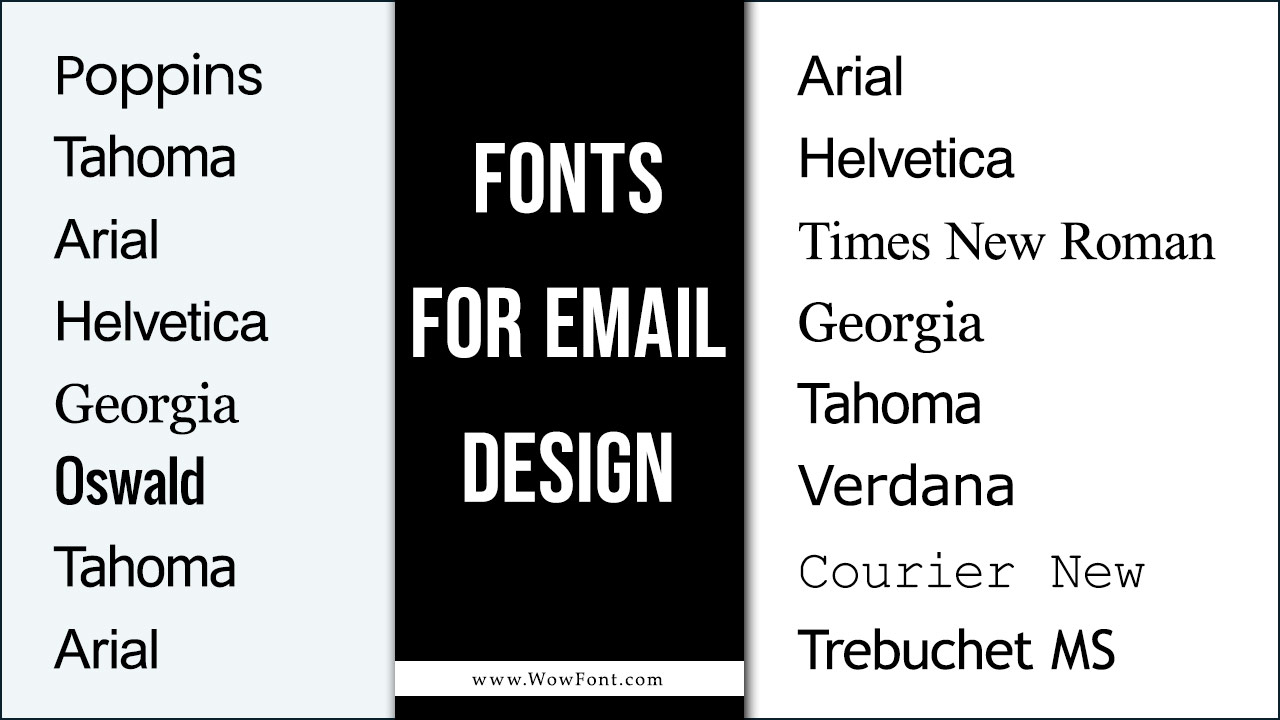
8 Fonts for Email Design
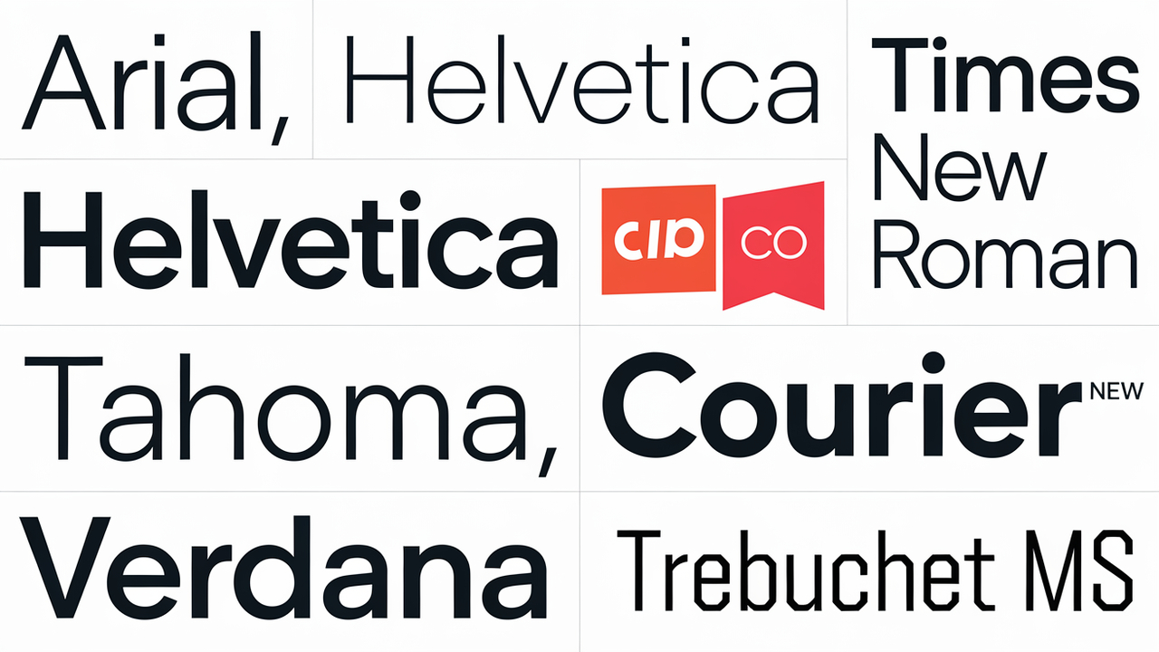
When designing email, selecting the right typeface is crucial for ensuring your messages are not only visually appealing but also easy to read. Here are 8 typefaces that are email-safe for use in all leading email provider services today:
- Arial
- Helvetica
- Times New Roman
- Georgia
- Tahoma
- Verdana
- Courier New
- Trebuchet MS
1. Arial Font Advantages
Arial gives your email messages a classy yet simple elegance. Its soft curves keep your message from appearing stiff or formal. This font is easy to read in multiple sizes and complements many styles of graphic design.
As an appealing and easy-to-read contemporary font, Arial is email-friendly. Its streamlined modern appearance makes it an ideal choice for email body content. This sans-serif font is also recommended for use in major headings, charts, and visual designs for your messages.
2.Benefits Of Helvetica Font
Helvetica is another attractive sans-serif font commonly used in email messages. It is especially appealing for creating attention-getting titles and phrases. However, the letters in this font are closely spaced, which can make medium-length and long email text somewhat difficult to read.
Despite its popularity across various types of digital content, Helvetica does not impart a dynamic or unique look to your copy. Yet, it is an email-safe font that renders well in all major email provider systems.
3. Qualities Of Times New Roman Font
Many web users choose Times New Roman as their default font. This email-safe serif font belongs to the serif font family and is one of the best-known typefaces. However, its narrow letter design makes Times New Roman best for use in major email headings, as using this font in the body of your message can make the content a slow read.
For a casual or artsy look, consider mixing this font with a more trendy style. This familiar typeface has been in use for nearly a century and requires less page space than multiple fonts. However, the narrow characters can make scanning content tiring for the eyes.
4. Features Of Georgia Font
Georgia is an ideal font for email content. As a serif typeface, it lends a professional, credible appearance to your messages. This font is often used in books, newspapers, and other printed materials. Its widely spaced characters provide easy reading of emails, particularly beneficial for longer texts.
Georgia is favoured by many businesses, both established firms and startups, due to its classic design. You can also mix Georgia font with more creative typefaces for a fresh, updated look.
5. Advantages Of Tahoma Font
Tahoma is a sans-serif font ideal for email content, designed specifically for on-screen text. A major feature of this typeface is the equal length of the upper and lower-case characters.
While it shares similarities with Verdana, Tahoma features slimmer letters that are more closely spaced. This Microsoft font is helpful when creating text boxes or text within graphic designs, fitting text into small spaces without creating a cramped visual effect.
6. Benefits Of Verdana Font
Verdana is a sans-serif font created for low-resolution screens. Its wide upper and lower-case characters are easy to read in email copy. The space between letters helps create long emails that are easy to scan quickly. Its simple, bold lines make this font extremely legible, making it a popular choice for designing email messages.
Interestingly, the font designer for his daughter created the name “Verdana” by combining the word “verdant” with her name, “Ana.”
7. Courier New Font Qualities
Courier New is an excellent typeface for email content. It belongs to the slab-serif font family and resembles a traditional typewriter font, often used for manuscripts and detailed reports.
This very legible font is popular on many web pages and in online sales catalogues. For those accustomed to traditional Courier typewriter fonts, Courier New offers a seamless transition into the digital realm. This font is also email-safe.
8. Characteristics Of Trebuchet MS
Trebuchet MS is a simple serif font by Microsoft, known for its clean and modern appearance. Initially deemed a “good web design font” for its ease of scanning at small sizes, it has become suitable for titles and headings. This typeface is slightly condensed and available in various weights for specific applications.
With a friendly and informal style, Trebuchet MS makes you appear more approachable in your emails. It’s common as an alternative to Arial and Verdana and is gaining popularity in both print and digital media.
Best Font Size For Email
Your email font should neither be extremely large nor too small. While there are no standardized font sizes for headlines or body text, your chosen email typeface should be no less than 10 points and no greater than 16 points. A very large font size can dominate email content and may appear distorted in some email provider platforms.
If your message typeface is too small, clients or prospective customers are likely to skip reading it, which can create issues, especially in transactional emails. Test your emails to ensure good quality and readability before sending them out, particularly if you’re launching a marketing campaign or sending numerous sales announcements.
Best Font For Email Signature
To appeal to businesses of all sizes and types in your emails, experts recommend the following choices as the best font for email signatures:
- Poppins
- Tahoma
- Arial
- Helvetica
- Georgia
These fonts look professional and instil feelings of trust and confidence in your message and brand. When choosing a signature font, ensure that it complements and aligns with your logos, images, or other visual content. If you select Poppins, a recommended web-safe font, it’s a good idea to choose a fallback font like Arial.
Best Font For Email Newsletters
Email newsletter designers and writers face the task of including a large amount of information in small spaces. They favour streamlined, sophisticated typefaces that promote a good click-through rate. The following fonts are frequently used for this purpose:
- Oswald
- Tahoma
- Arial
Mailchimp offers innovative advice, examples, and templates to assist you in creating top-quality email newsletters.
Conclusion
Choosing the right fonts for your email design can significantly impact the effectiveness of your email communication. By selecting email-safe fonts, utilizing font pairs, and incorporating Google Fonts, you can create visually appealing and readable emails.
Remember, while decorative fonts can add personality, clarity and professionalism should always be your primary focus. With these guidelines, you’re well on your way to crafting good emails that resonate with your audience.
Frequently Asked Questions (FAQs)
1.What Are Email-Safe Fonts?
Email safe fonts are typefaces that are widely available and render consistently across different email clients.
2.Can I Use Decorative Fonts In My Emails?
Yes, but use them sparingly and only for headings or special elements to maintain readability.
3.What Is The Best Font For Email Newsletters?
Fonts like Arial, Helvetica, and Georgia are popular choices due to their readability.
4.What Is The Difference Between Web Safe Fonts And Email Safe Fonts?
Web safe fonts are primarily designed for websites, while email safe fonts are optimized for use in email communication.
5.Should I Use Custom Fonts In Emails?
You can use custom fonts, but ensure you provide a fallback option for clients that may not support them.
Leave a Comment