Deezer, the renowned music streaming service, has established a strong visual identity with its distinctive logo and font. The current Deezer logo, featuring the beating heart logo, is an embodiment of the brand’s passion for music and its commitment to creating a sense of belonging for its users. Central to this identity is the Deezer Sans font, developed in collaboration with Koto Studio and the NaN Type Foundry.

About Deezer Sans

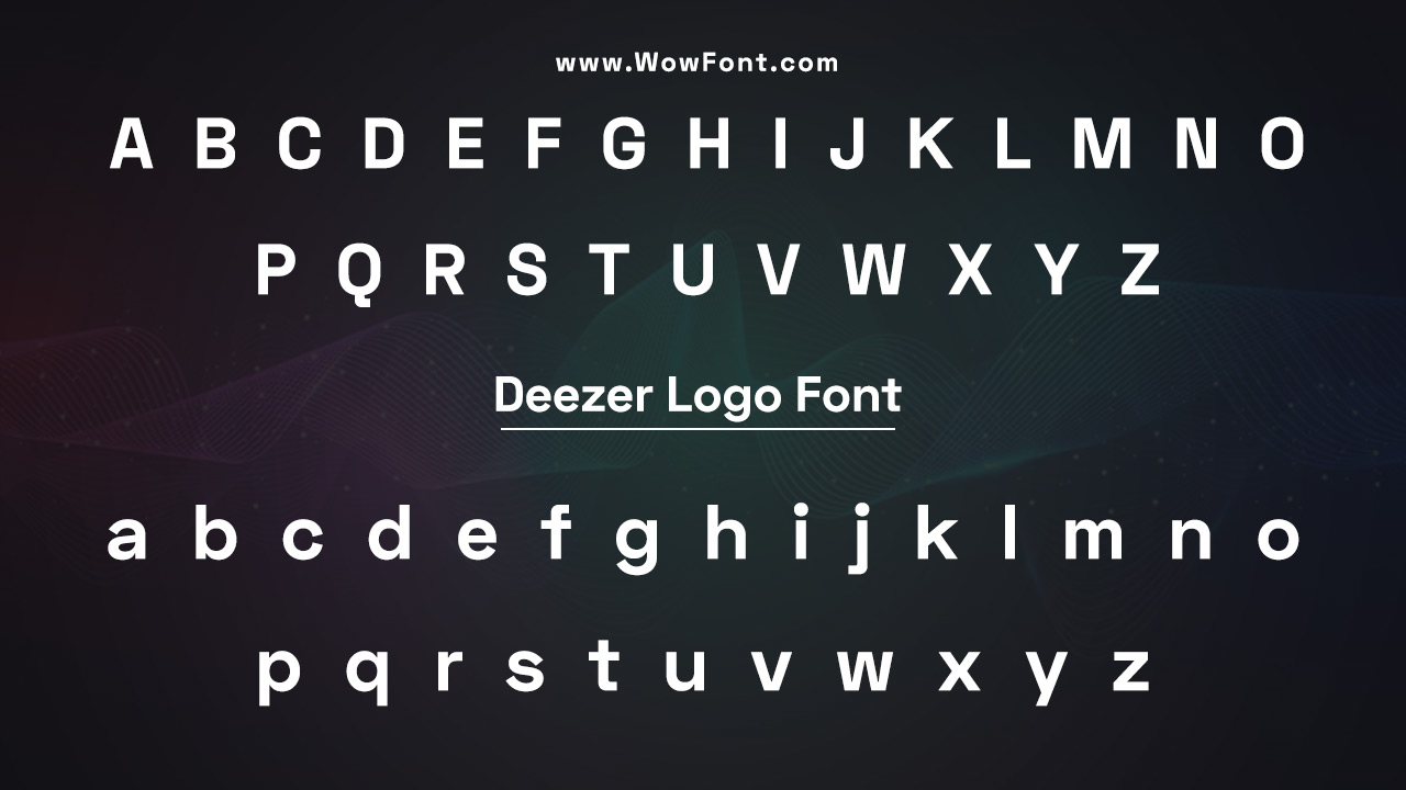
Deezer Sans reflects the rhythms of music and provides versatility across various digital and print applications as a variable font. This font family incorporates a wide range of weights and styles, allowing for customized typography that suits different content types, from long-form articles to concise social media posts. The font features clean lines and contemporary aesthetics, making it a perfect fit for a modern music platform.
Design and Typography
The design of Deezer Sans was led by Luke Prowse and his team, including Maria Garrido and Joe Ling. The font draws visual cues from the heart logo and the musical rhythms that define the Deezer brand. By using a combination of graphic elements and illustrative elements, the typography resonates with the vibrant culture of music and the creative expression of artists.
Font Styles And Weights
Deezer Sans offers various styles, including:
- Regular: Ideal for body text and long-form content.
- Bold: Suitable for headlines and titles, making a strong impact.
- Condensed: Perfect for tighter spaces, such as icons and buttons.
The variable font feature allows users to adjust weight and style seamlessly, enhancing the overall user experience across different platforms.
Brand Visual Identity
The incorporation of Deezer Purple as a primary color in the logo and branding elements further strengthens the brand’s visual identity. The Deezer wordmark is designed to be immediately recognizable, with a modern touch that aligns with the tastes of Deezer users.
Pairing Options
When looking to pair Deezer Sans with other fonts, consider using:
- Avenir: Its clean, geometric lines complement Deezer Sans beautifully, making it suitable for user interfaces and marketing materials.
- Roboto: This versatile sans-serif font offers great readability and works well across digital platforms.
- Open Sans: Known for its legibility, this font can enhance any text-heavy content while maintaining a modern look.
Iconography And Graphic Design
The new visual identity features innovative iconography that aligns with the musical theme. Icons are designed using the curves of the beats, ensuring they are distinctive yet functional. This cohesive approach to graphic design integrates seamlessly into the overall Deezer brand experience.
Conclusion
The Deezer logo font plays a crucial role in the brand’s identity, encapsulating the essence of music and connection. With its thoughtful design and versatility, Deezer Sans exemplifies how typography can enhance visual storytelling and strengthen a brand’s presence in the competitive landscape of music streaming.
FAQs
1.What Is The Name Of The Font Used In The Deezer Logo?
The font used in the Deezer logo is called Deezer Sans, designed by Koto Studio and the NaN Type Foundry.
2.What Inspired The Design Of Deezer Sans?
Deezer Sans is inspired by the beating heart logo and the musical rhythms that define the Deezer brand.
3.Can I Use Deezer Sans For My Projects?
Deezer Sans is a custom font; however, you can find similar typefaces like Avenir, Roboto, or Open Sans for your projects.
4.What Are The Different Styles Available In Deezer Sans?
Deezer Sans offers several styles, including Regular, Bold, and Condensed.
5.Who Were The Designers Behind Deezer Sans?
The design team for Deezer Sans included Luke Prowse, Maria Garrido, and Joe Ling.


Leave a Comment