In the world of graphic design, font pairing is an art form that combines aesthetics with functionality. Selecting the right font can transform your design, ensuring that it communicates your message effectively while also being visually appealing.
This guide will provide you with best practices for font pairing, helping you create harmonious and engaging typography using various font styles, including serif fonts, sans serif fonts, decorative fonts, and more.

Understanding Font Types
Before diving into the best practices for pairing fonts, it’s essential to understand the different types of fonts:
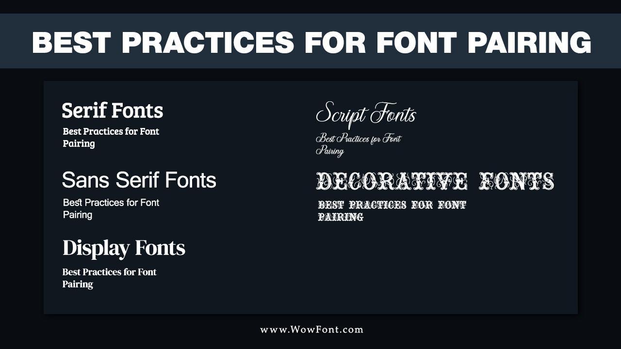
- Serif Fonts: These are characterized by small decorative strokes at the ends of letters. Classic serif fonts, like Times New Roman and Georgia, are often used in print because they are easy to read.
- Sans Serif Fonts: These fonts lack the decorative strokes that serif fonts have, resulting in a cleaner and more modern appearance. Fonts like Arial and Helvetica fall into this category and are often preferred for digital designs.
- Display Fonts: These are decorative typefaces designed for headlines or titles. They are typically bold and eye-catching but should be used sparingly to avoid overwhelming the reader.
- Script Fonts: Often resembling handwriting, these fonts add a personal touch to designs. However, they should be used carefully, as they can compromise readability.
- Decorative Fonts: These fonts are primarily used for artistic purposes and can add a unique flair to your design. They work well in branding or promotional materials but should not dominate the text.
Best Practices For Font Pairing

Font pairing is key to good design. It improves visual harmony and readability. Start by mixing different font types, like pairing a serif with a sans serif. Use bold headings and lighter body text to create a clear hierarchy. Stick to two or three fonts to avoid confusion. Make sure they share a similar style to stay cohesive.
Aim for contrast by choosing fonts that look different and using color to highlight important parts. Always prioritize readability, especially for body text. Test your fonts at different sizes to ensure they remain clear. Use online tools to pair ideas and choose fonts that match your brand’s identity. Feel free to experiment and ask for feedback.
1. Contrast Is Key
When combining fonts, contrast is essential. Pairing contrasting fonts ensures that different elements of your design stand out. For instance, using a bold font for headlines alongside a light serif font for body text creates a dynamic visual hierarchy.
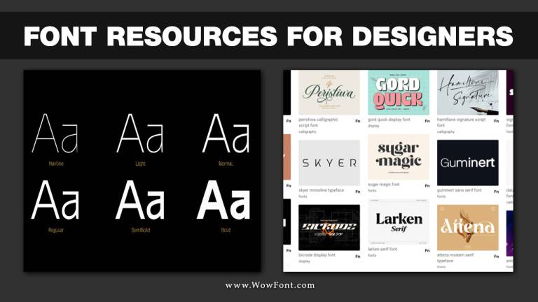
- Font Weight: Varying the weight of your chosen fonts (bold, regular, light) can enhance contrast. A display font paired with a sans serif typeface is a classic choice for achieving this effect.
- Font Size: Ensure that your primary font (usually the heading) is significantly larger than the body font. This size difference will help guide the reader’s eye through your content.
2. Keep Key Qualities Similar
While contrast is important, maintaining some similarities between fonts can create a cohesive look. Focus on the following aspects:
- X-Height: Fonts with similar x-heights will pair well together. This visual similarity helps maintain harmony in your design.
- Font Family: Using fonts from the same family can create a seamless appearance. Many Adobe fonts and Google fonts offer families with various styles that complement each other effectively.
- Mood: Ensure that the mood of your chosen fonts aligns. Pairing a playful handwritten font with a serious sans serif typeface can lead to confusion. Choose complementary fonts that evoke a similar emotional response.
3. Use Sans Serif For Headings And Serif For Body Text
A common practice in typography is to use sans serif fonts for headings and serif fonts for body text. This combination allows for easy navigation while keeping the text readable.
- For example, pairing a bold sans serif font for headings with a classic serif font for body copy provides a balance between modernity and tradition.
4. Test Different Variations
It’s crucial to test your font pairings in various contexts and styles.
- Experiment with the italic and bold styles of both fonts to see how they interact with each other. Some combinations may look great in their default forms but clash when variations are applied.
- Consider different sizes and layouts to ensure that your design maintains readability across platforms, whether it’s for a website or print materials.
5. Limit Your Choices
While it can be tempting to use multiple fonts, limiting your choices to two or three can lead to a cleaner design.
- Assign specific roles to each font: one for headlines, one for body text, and potentially a third for accents or quotes. This strategy helps to avoid clutter and keeps your design focused.
6. Seek Inspiration And Feedback
Studying successful font pairings can provide valuable insights into effective combinations. Platforms like Google Fonts and typography blogs often showcase innovative font pairings.
- Don’t hesitate to seek feedback from peers or clients. They may provide perspectives that can enhance your font choices or overall design.
7. Trust Your Instincts
Ultimately, trust your gut. If a font combination feels off, it probably is. Experiment with different font styles and arrangements until you find the right balance.
Conclusion
Effective font pairing is vital in graphic design, allowing you to create a cohesive and visually appealing experience for your audience. Following these best practices, including understanding font types and maintaining a balance between contrast and similarity, can elevate your designs and enhance readability. Whether you’re choosing Google fonts, Adobe fonts, or other decorative typefaces, remember to keep your audience in mind for the best results.
FAQs
1.What Is The Best Way To Pair Fonts?
The best way to pair fonts is to create contrast between them while keeping key qualities similar, such as x-height and mood.
2.Can I Mix Serif And Sans Serif Fonts?
Yes, mixing serif and sans serif fonts is a popular and effective strategy for creating visual interest in typography.
3.How Many Fonts Should I Use In One Design?
Limiting your design to two or three fonts is generally best. This helps maintain focus and clarity.
4.What Are Some Popular Font Pairings?
Some popular font pairings include pairing a bold sans serif font with a classic serif font for body text, such as Montserrat and Merriweather.
5.How Can I Test My Font Pairings?
Test your font pairings by trying them in various styles (italic, bold) and sizes, and see how they work in different contexts, like websites or print.


Leave a Comment