Fonts play a critical role in religious texts, guiding readers through sacred words with clarity, reverence, and elegance. Whether you’re working with the New Testament, the Gutenberg Bible, or modern spiritual writings, choosing the right font profoundly affects how people perceive these texts.
From book designers to churches, the font choice is more than an aesthetic decision. It’s about ensuring you convey the message with the appropriate level of sacredness and accessibility.

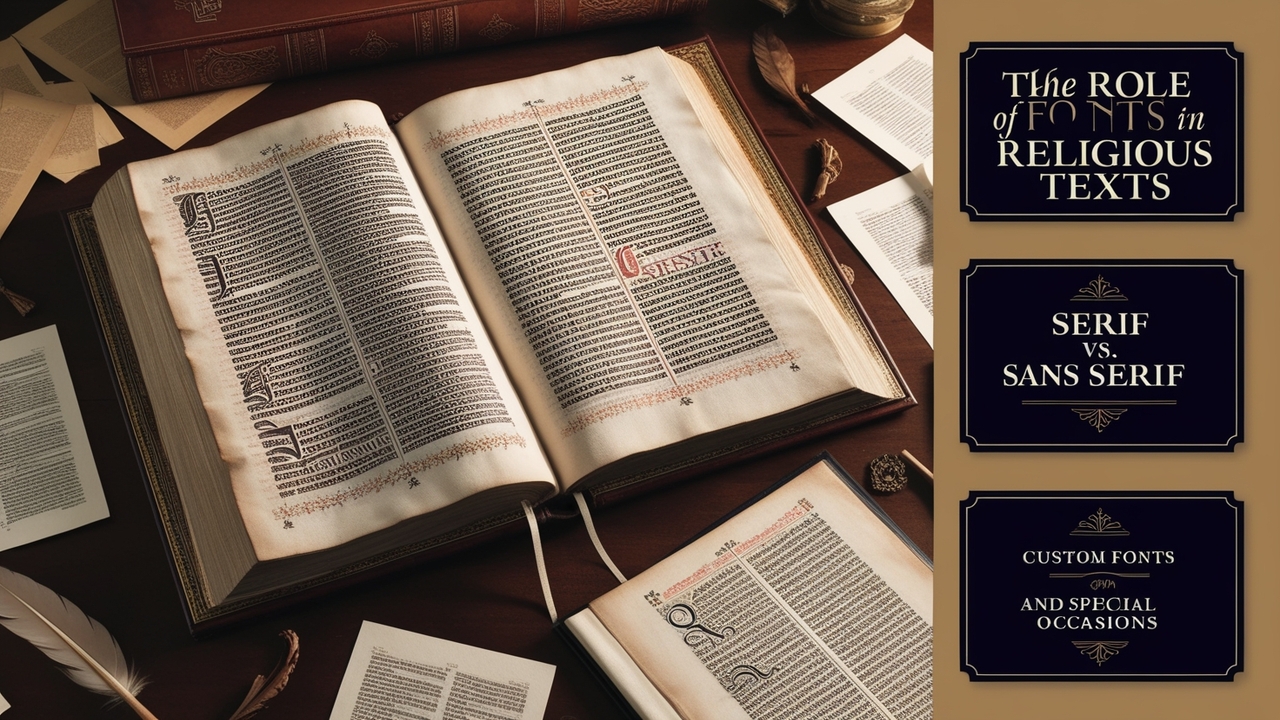
The Role Of Fonts In Religious Texts

Religious texts often use fonts that emphasize clarity and reverence, reflecting the profound nature of the content. For example, the Holy Spirit and the teachings of Jesus Christ demand a typeface that balances tradition and readability. John Hudson, a renowned type designer, has contributed significantly to developing fonts that cater to complex scripts and languages used in religious texts.
While historical texts like the Gutenberg Bible utilized serif fonts for their legibility and classical feel, modern religious texts often incorporate a wider range of typefaces. These include sans serif fonts like Open Sans, a favorite from Google Fonts, which offers a clean and modern look suitable for digital platforms.
Serif vs. Sans Serif In Religious Texts
Designers traditionally use serif fonts, such as Times New Roman, in printed religious materials for their elegance and readability in long-form texts. The small embellishments on the edges of letters make serif fonts an excellent choice for body text, especially in sacred texts where clarity and reverence are key.
In contrast, sans serif fonts, like Open Sans, are more contemporary and widely used in church supply materials, digital publications, and religious blogs. Their simplicity ensures a clean reading experience, especially in smaller font sizes often used for small text and scripture footnotes.
Custom Fonts And Typeface Variations
Some churches and organizations invest in custom fonts to reflect their identity and values. Different typefaces can evoke various spiritual tones, from formal and sacred to approachable and modern. For example, a monospaced font may be used for digital religious texts, while a decorative font might enhance baptism invitations or religious event posters.
Font family selections also allow flexibility in weight and style, giving book designers a range of options when working on religious publications. Choosing from the same family ensures consistency in design, from bold headings to light body text.
Decorative Fonts And Special Occasions
Designers might introduce decorative elements for special occasions like weddings, baptisms, or holiday worship services. Designers often use fonts that mimic calligraphy, such as certain display fonts, for invitations and ceremonial printed materials. These fonts convey a sense of celebration and reverence while maintaining the elegance expected in a religious setting.
Fonts and Language In Religious Texts
Religious texts are often published in multiple languages, each requiring attention to typography’s nuances. Fonts that work well for English-language Bibles may not suit Arabic, Hebrew, or Sanskrit texts. John Hudson’s expertise in developing multi-script fonts highlights the importance of accommodating various languages in religious publications, ensuring the word is accessible to all.
Readability And Accessibility
Whether designing a church bulletin or printing the New Testament, readability is paramount. The right font should enhance the reader’s connection with the text, allowing them to focus on the message rather than struggle deciphering the letters. For this reason, many religious texts use sans serif fonts or geometric designs, like geometric sans, to ensure clarity across different ways the text is consumed—whether on paper or screen.
Fonts like Open Sans, known for their versatility and readability, are commonly used across digital platforms and printed materials, making them an ideal choice for religious publications that must reach diverse audiences.
The Importance Of Font Size And Color
Selecting the perfect font also involves choosing the appropriate font size and color. For sacred texts, font size is crucial—too small, and the small text may be unreadable for congregants during worship; too large may detract from the overall aesthetic. Designers typically keep color minimal to maintain a serious tone, often using black or dark hues.
Conclusion
The right font in religious texts, from the Bible to church bulletins, can elevate the experience of reading sacred words. Whether you choose a serif font like Times New Roman for its classical feel or a sans serif font like Open Sans for its modern clarity, it should always enhance the reader’s connection to the message. In today’s world, where digital and printed materials coexist, selecting fonts that work across multiple formats ensures that the word of Jesus Christ and other sacred teachings are accessible to all.
FAQs
1.What Is The Best Font For Religious Texts?
The best font depends on the context. Times New Roman (serif) is an excellent choice for printed materials. Open Sans (sans serif) is favored for its clarity for digital use.
2.Are Custom Fonts Necessary For Churches?
Custom fonts can help churches create a unique identity, but they aren’t necessary. Many religious texts and materials use widely available fonts like Google Fonts.
3.What Size Font Should Be Used For Bibles?
A font size of 10 to 12 points is standard for body text in Bibles, ensuring readability without overcrowding the page.
4.What Is The Difference Between Serif And Sans Serif Fonts In Religious Texts?
Serif fonts like Times New Roman are traditional and ideal for long-form reading, while sans serif fonts like Open Sans offer a modern, clean look, especially for digital formats.
5.Why Is Readability Important In Religious Fonts?
Readability ensures that readers can easily focus on the text without distraction, essential for connecting with the spiritual message of religious content.


Leave a Comment