Typography is a powerful design element that shapes the look and feel of a project, from websites to logos and beyond. It’s more than just arranging letters; typography brings personality, emotion, and visual interest to a design. Let’s explore creative uses of typography in design that can elevate your work and captivate your audience.

Top 12 Ideas For Creative Uses Of Typography In Design

Typography is a fundamental element in design that goes beyond mere text presentation. When used creatively, it can elevate a design’s impact, convey mood, and capture attention in unique ways. Here are some inventive ideas to explore creative uses of typography in design:
1. Text As Image
Use letters and words to create an image (like a face or object). This technique uses text of varying sizes and weights to form intricate details.
Shape letters to resemble objects they describe (e.g., making the letter “O” look like a doughnut in a bakery logo). Integrate custom fonts and type design to create logos in which the text is the central visual element.
2. Kinetic Typography
Use motion graphics to make letters and words move in ways that express meaning. This is common in video intros, websites, or advertisements to engage users with dynamic text. For web design, create text that reacts to user interaction (like scrolling), revealing hidden messages, or changing its appearance based on how the page is navigated.
3. Layered Typography
Stack or layer words to create depth and texture. Adjust opacity, size, and color to ensure readability while creating visual interest. Combine text and background images with thoughtful placement, allowing the type to interact with the visuals. Make sure the text complements the image without overpowering it.
4. Minimalist Typography
In minimalist designs, use whitespace to draw attention to the text. Sparse, large, or spaced-out letters can have more visual impact when contrasted with an otherwise clean, empty space. Employ rigid or flexible grids where each letter perfectly fits a geometric layout, giving a clean and organized structure to the typography.
5. Letters As Cartoon Characters
Imagine turning letters into playful cartoon characters that express emotions and movement. Typography designers often use this creative approach to give fonts a unique personality. It’s an excellent technique for branding, especially in logo design and children-focused products. This style is ideal for typography enthusiasts looking to add a whimsical touch to their design.
6. Overlapping Characters
Overlapping letters can create visual interest by blending characters together. This technique allows designers to explore how shapes interact, producing a sense of depth and complexity. Designers can merge elements without sacrificing readability using sans serif typefaces or script fonts. This is particularly effective for UX design and web design projects, where modern and sleek looks are key.
7. Handwritten Styles
Handwritten fonts give designs a personal and authentic touch. This style mimics the imperfections of human writing, making it an ideal choice for branding that seeks to appear approachable and down-to-earth. Script fonts and other handwritten fonts are popular in interior design blogs, personal branding, or creative logo designs. For UI design, they can be used sparingly to add flair without compromising on readability.
8. 3D Effects
Typography can jump off the screen with 3D effects, giving letters a sense of depth and realism. This effect adds dimension and movement to designs, often used in logos, graphics, and posters for bold, impactful designs. Good typography principles, like letter spacing and font choice, are crucial to maintaining readability when working with this complex style.
9. Text With Texture
Add texture to letters by filling them with gradients, patterns, or photographic textures. This can give words a tactile, three-dimensional quality. For luxury branding or print media, give the type a metallic sheen or an embossed look, creating a sense of depth and materiality.
10. Typographic Patterns
Create repetitive patterns using letters or words, making the text decorative. This can be useful for backgrounds, posters, or packaging designs. Arrange text in circular or symmetrical patterns, creating a hypnotic, intricate design that draws the viewer in.
11. Combining Uppercase And Lowercase
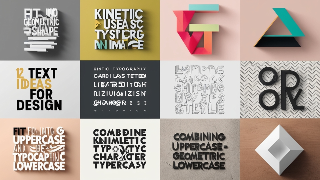
Mixing uppercase and lowercase letters in unexpected ways adds quirkiness to a design. This style is popular in logo design and display fonts, where designers can play with text structure for added visual interest. The right font choice and careful letter spacing ensure the message remains clear while standing out.
12. Fit Into Geometric Shapes
Typography doesn’t always have to follow traditional lines. Letters can be shaped to fit into geometric patterns like circles, triangles, or grids, creating a visually appealing structure. This is a great tool for graphic designers to explore web design and branding, providing a unique framework for creative projects. Geometric typography challenges designers to balance readability and creativity, producing an impactful design.
Conclusion
Typography is more than just a tool for displaying text; it’s a vital design element that can transform a project’s look, feel, and message. Designers can create impactful designs that captivate their audience by creatively utilizing styles such as 3D effects, handwritten fonts, retro themes, or even glitchy distortions.
Whether you’re a graphic designer, web designer, or typography enthusiast, experimenting with different techniques and styles can lead to truly innovative results. Good typography enhances readability and brings a unique flair to every design.
Frequently Asked Questions (FAQs)
1.What Is Typography In Design?
Typography in design refers to arranging type to make written language readable, visually appealing, and effective in communication.
2.What Are Display Fonts?
Display fonts are decorative fonts designed to attract attention, typically used in large sizes for headlines or branding.
3.Why Is Font Choice Important In Design?
The right font can enhance readability, convey the right mood, and support the overall aesthetic of the design.
4.How Does Typography Impact UX Design?
Typography affects user experience by influencing how easily users can read and interact with text on a website or app, making it a key aspect of UX design.
5.What Are Some Good Font Pairings?
Popular font pairings include combining a sans serif typeface with a handwritten font or using bold and light variations of the same typeface for contrast.
6.How Do I Choose A Font For My Design Project?
Consider the tone of your project, the readability of the font, and how it aligns with your overall branding goals to choose the right font.
7.What Is Floral Typography?
Floral typography incorporates floral elements into letters, often used in interior design and fashion to add a delicate, organic feel.
8.What Is The Role Of Letter Spacing In Typography?
Letter spacing (kerning) ensures that text is readable and visually balanced, playing a significant role in good typography practices.
9.How Can Typography Enhance Logo Design?
Effective logo typography can convey a brand’s identity, create visual impact, and ensure the logo is memorable and easily recognizable.
10.What Tools Can Help Improve My Typography Skills?
Tools like Adobe Illustrator, Creative Bloq, and typography-focused websites offer tutorials and resources for improving typography skills.


Leave a Comment