Combining fonts effectively is crucial for designers, marketers, and content creators alike. When done right, it enhances readability, creates a visual hierarchy, and engages the audience more effectively.
Choosing the right font is essential; consider mixing sans serif and serif typefaces to provide contrast. Using decorative fonts sparingly can add visual interest without overwhelming the viewer.
This article will explore practical tips for combining different font families, including display fonts and cursive fonts, to achieve a clear visual hierarchy. By understanding text hierarchy and employing multiple fonts thoughtfully, you can ensure your content stands out and communicates effectively.

Understanding Visual Hierarchy
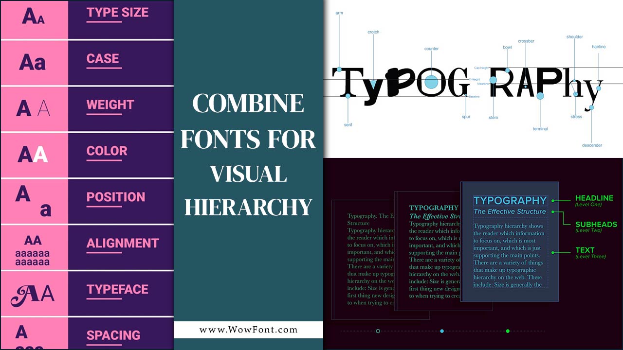
Visual hierarchy refers to the arrangement and presentation of elements in a way that signifies their importance. It guides the viewer’s eye through the design, helping them understand the content at a glance. Fonts play a vital role in establishing this hierarchy. Different font sizes, styles, and combinations can emphasize specific information, making it easier for readers to absorb your message.
How To Combine Fonts For Visual Hierarchy

To create an effective visual hierarchy, combine a classic serif typeface for headings with a sans serif font for body text. Use different font weights and contrasting typefaces, like a decorative font for emphasis. Limit your choices to two or three font families, ensuring visual interest and coherence while maintaining text hierarchy for clear communication.
Choose Complementary Fonts
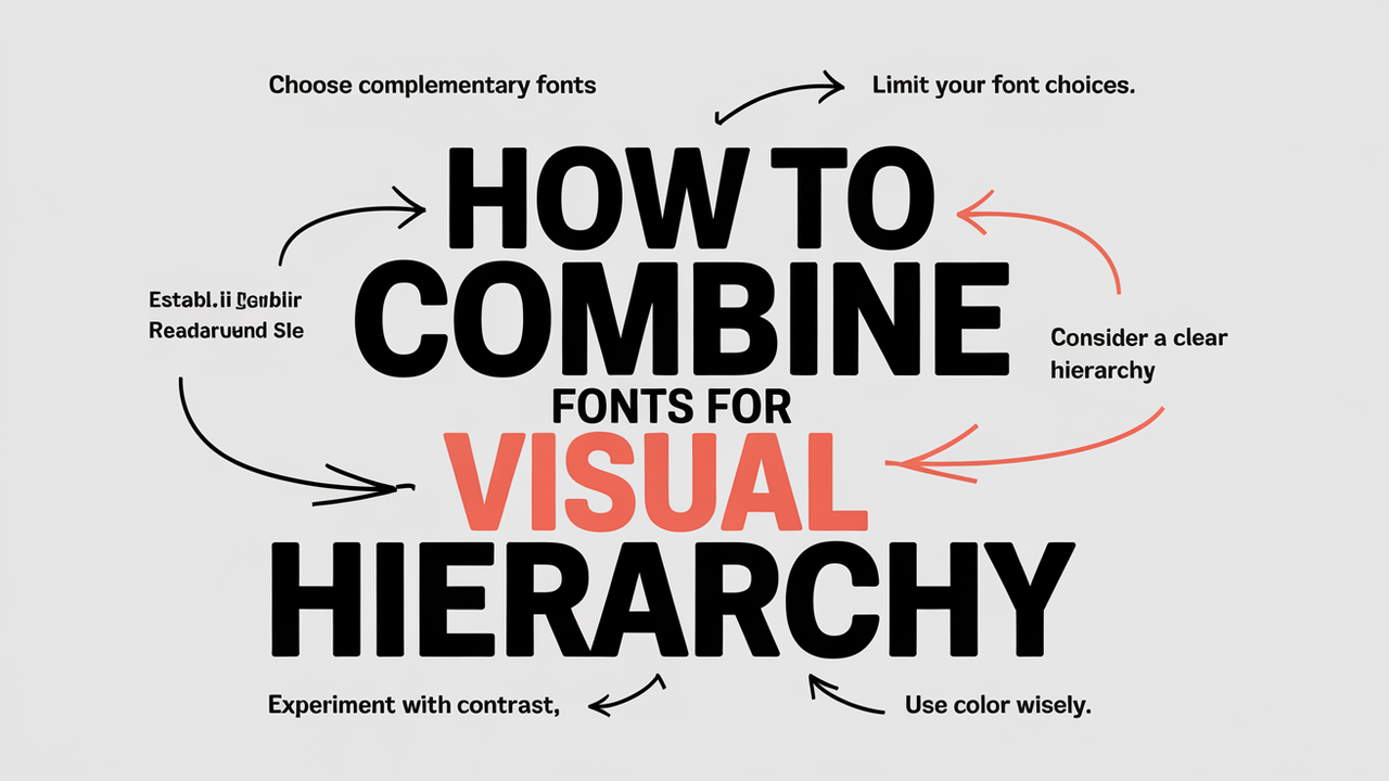
Select fonts that work well together. For example, pair a serif font (like Times New Roman) with a sans-serif font (like Arial) to create contrast. Complementary fonts enhance readability and aesthetic appeal.
Limit Your Font Choices
Stick to two or three fonts in a design. Too many fonts can create visual clutter. A general rule is to use one font for headings, another for body text, and possibly a third for accents.
Establish A Clear Hierarchy
Use size, weight, and style to create a hierarchy. For instance, headings should be larger and bolder than body text. This differentiation helps guide the reader’s attention.
Consider Readability
Always prioritize readability over style. Ensure that the font size is legible on different devices. Avoid overly decorative fonts for body text, as they can be hard to read.
Experiment With Contrast
High contrast between fonts can draw attention to important information. For example, use a dark font on a light background, or vice versa. This technique can effectively highlight headings or key points.
Use Color Wisely
Incorporating color into your font choices can enhance visual hierarchy. Use color to differentiate headings from body text, but keep it consistent. Avoid using too many colors to maintain a clean look.
Match Font Personality To Content
Ensure the font style aligns with your content’s tone. For formal content, opt for traditional serif fonts, while casual content may benefit from playful, rounded fonts.
Test And Iterate
Don’t be afraid to experiment with different font combinations. Use mockups to see how your design looks in various formats. Gather feedback and be open to making adjustments.
Utilize Font Pairing Tools
Many online tools can help you find font combinations that work well together. Websites like Google Fonts, FontPair, and Canva offer suggestions and allow you to preview different combinations.
Consider Accessibility
Always keep accessibility in mind when combining fonts. Ensure your choices are readable for individuals with visual impairments. Use sufficient contrast and avoid overly intricate designs.
FAQs
1.What Is Visual Hierarchy In Typography?
Visual hierarchy in typography refers to the arrangement of text elements in a way that conveys their importance, helping readers navigate the content easily.
2.How Many Fonts Should I Use In A Design?
It’s best to use two to three fonts in a design to avoid clutter. A common combination is one font for headings, another for body text, and a third for accents.
3.Can I Mix Serif And Sans-Serif Fonts?
Yes! Mixing serif and sans-serif fonts is a popular technique. This combination creates contrast and can enhance visual hierarchy.
4.What Are Some Good Font Pairing Websites?
Websites like Google Fonts, FontPair, and Canva offer suggestions and tools for finding complementary font pairings.
5.How Can I Improve The Readability Of My Fonts?
Use a legible font size, appropriate line spacing, and high contrast between the text and background to enhance readability.
6.Is It Important To Consider Color When Combining Fonts?
Yes, color can help differentiate headings from body text and enhance visual hierarchy. However, maintain consistency and avoid using too many colors.
7.What Font Styles Should I Use For Formal Content?
Traditional serif fonts like Times New Roman or Georgia are suitable for formal content, while playful, rounded fonts work better for casual content.
8.How Do I Create A Visual Hierarchy With Font Size?
Use larger and bolder fonts for headings compared to body text. This differentiation helps guide the reader’s attention to important information.
9.What Are Some Common Mistakes To Avoid When Combining Fonts?
Common mistakes include using too many fonts, poor contrast, and ignoring readability. Always prioritize clarity and simplicity.
10.How Can I Test My Font Combinations?
Use design mockups to see how different font combinations look in various formats. Gather feedback from others to refine your choices.


Leave a Comment