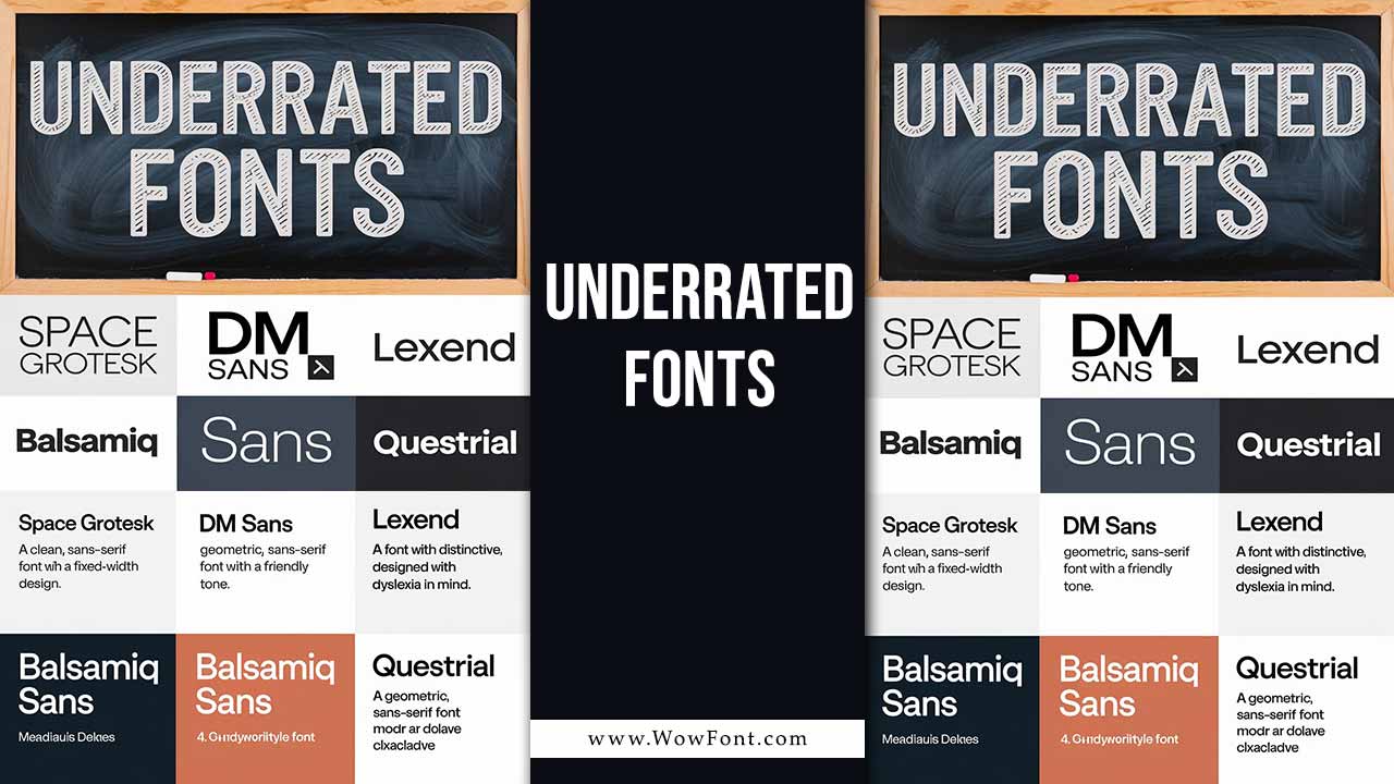
In the world of typography, many designers gravitate toward popular choices like Times New Roman or Open Sans. But there’s a treasure trove of underrated fonts waiting to be explored.
This guide will highlight some exceptional fonts available on platforms like Google Fonts and Adobe Fonts. They’re perfect for various design applications such as UI design, web design, and graphic design. While Google Fonts and Adobe Fonts offer an extensive collection, many underrated fonts remain largely undiscovered by designers.
Why Underrated Fonts Matter In Design
Some fonts remain underutilized, despite their unique appeal. Space Grotesk, a sans serif typeface, offers modern minimalism and works well in both large displays and small sizes, making it a favorite among graphic designers. Similarly, Rasmus Andersson’s work on variable fonts allows for flexible, customized designs that adjust to different screen sizes, offering a better user experience.
The Indian Type Foundry has introduced many unique fonts that cater to both modern and traditional typography needs, combining aesthetic appeal with practicality. These fonts are ideal for commercial use, offering flexible licensing options for designers working on web design or logo design.
Recommended Underrated Fonts
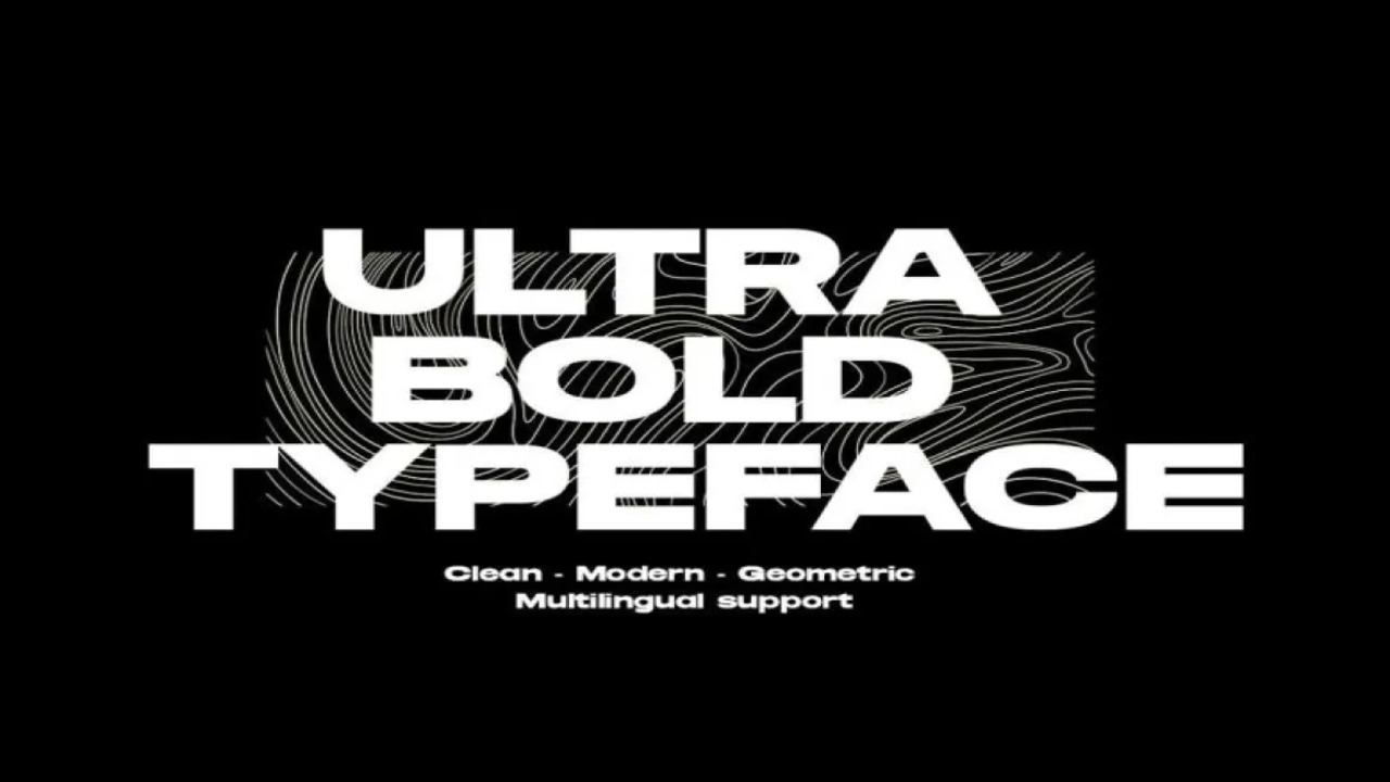
Choosing the right font can significantly influence readability and overall aesthetics in your projects. While familiar fonts like Arial and Helvetica serve their purpose, experimenting with underrated options can elevate your designs. They can set your project apart, providing a fresh look that resonates with your audience.
1. Space Grotesk
Space Grotesk is a unique sans serif typeface inspired by the fixed-width Space Mono family. Its proportional design and clean lines make it an excellent choice for body text and headers alike. This font pairs well with more traditional serif fonts to create a striking contrast in typography.
2. DM Sans
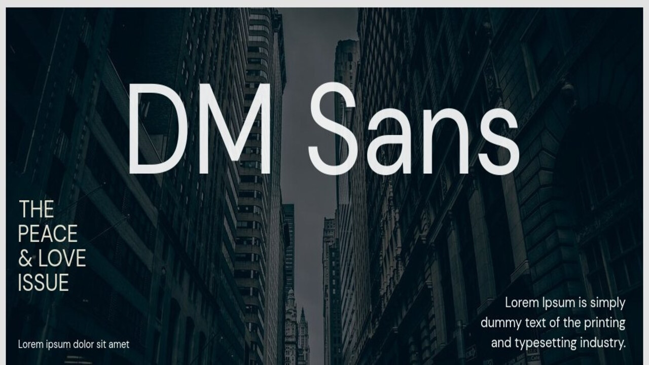
Designed for legibility, DM Sans is perfect for smaller sizes. This geometric sans serif is ideal for modern UI design, where clarity is paramount. It maintains a friendly tone while ensuring readability across various devices.
3. Lexend
Lexend is an innovative font developed with dyslexia in mind. Its distinctive shapes help reduce visual stress, making it a fantastic choice for any content that prioritizes accessibility. This font is especially useful in web design, where user experience is critical.
4. Balsamiq Sans
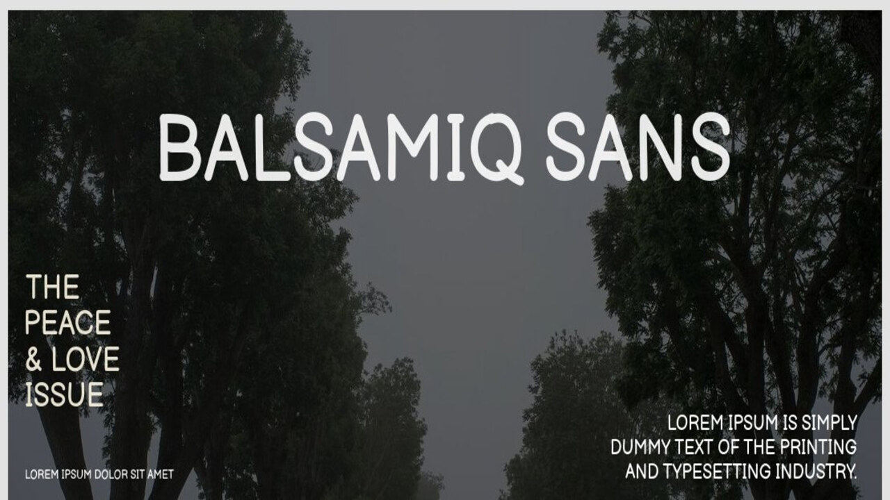
With its casual, handwritten style, Balsamiq Sans is perfect for prototypes and UI design elements. Its friendly character makes it suitable for applications that aim to foster a warm connection with users.
5. Questrial
This geometric sans serif strikes a balance between modern and classic. Questrial is versatile for both headings and body text, making it an excellent choice for websites that require a cohesive visual style.
Finding The Right Font For Your Design
When selecting fonts, it’s crucial to choose based on style, weight, and italic preferences. Consider using matching italics for emphasis or a script font to add elegance and personality. Whether you’re designing for Fanduel NFL odds, or creating an elegant New York style design, the font size and font weight are important to ensure readability across different platforms.
Using Different Fonts And Styles For Various Projects
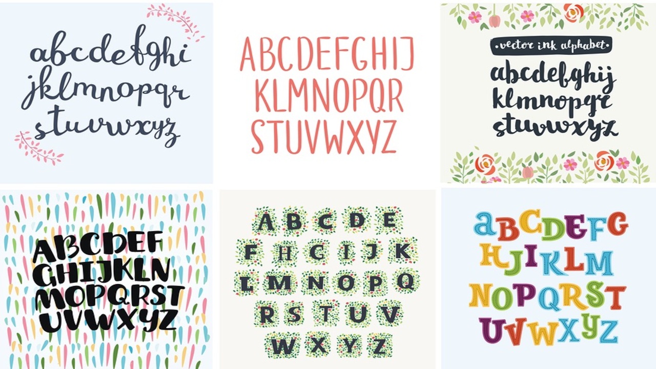
Designers can utilize different fonts for specific projects. A web-safe font like Open Sans ensures compatibility across devices, while cursive fonts and script fonts add a personal touch to invitations or event branding. The right font sets the tone, whether you’re working on logo design or preparing recent posts for a blog. Fonts also play a role in matching italic styles and adding a sense of uniqueness.
The Importance Of Font Choice
Choosing the right font is crucial in web and graphic design. It’s not just about aesthetics but also about readability and functionality. Fonts like Comic Sans, once widely criticized, now have a unique place in specific, playful designs. On the other hand, serif fonts such as Times New Roman are known for their professional, classic look, often used in print materials.
In UI design, fonts such as Open Sans and Space Grotesk are favored for their clean lines and readability at small sizes, making them ideal for web design and mobile interfaces. These free fonts are not only aesthetically pleasing but also practical, offering a wide range of weights and styles.
Conclusion
Typography is an essential part of graphic design, affecting how we perceive information. Selecting the right font involves considering style, weight, font size, and how the typeface pairs with other elements. Explore underrated fonts and experiment with variable fonts to elevate your design projects.
Exploring underrated fonts expands your typographic toolkit, allowing for creative expression and effective design solutions. By integrating these lesser-known options into your work, you can enhance the overall impact of your designs and create memorable user experiences.
FAQs:
1.What Are Underrated Fonts?
Underrated fonts are typefaces that are often overlooked but offer unique design qualities, ideal for a variety of projects.
2.What Is The Difference Between Serif And Sans Serif Fonts?
Serif fonts have small lines or strokes attached to the ends of letters, while sans serif fonts are without these lines, offering a cleaner and modern look.
3.Can I Use Free Fonts Commercially?
Many free fonts are available for commercial use, but always check the license before using them in projects like logos or websites.
4.Why Are Variable Fonts Important In Web Design?
Variable fonts allow for a range of weights and styles within a single font file, optimizing page load times and providing design flexibility.
5.How Do I Pair Fonts Effectively?
When pairing fonts, mix contrasting styles like a serif font with a sans serif or use matching italic for added emphasis, ensuring readability.
Leave a Comment