Font creation is a complex but rewarding process that demands a strong understanding of type design principles and tools. Beginners can start with user-friendly software like FontLab Studio or Glyphs Mini.
The journey begins with sketching your font design ideas and gradually digitalizing them using a font editor. Advanced techniques like kerning and incorporation of ligatures contribute to a polished and professional font file. Testing and refining are crucial to ensure optimal readability and visual harmony in different contexts.
In a world full of images, fonts are important for communication. Font creation, or type design, may look like a complicated art, but anyone can learn it if they have interest and time. This guide will teach you the basics of font design. You will gain the skills you need to start making your own unique fonts.
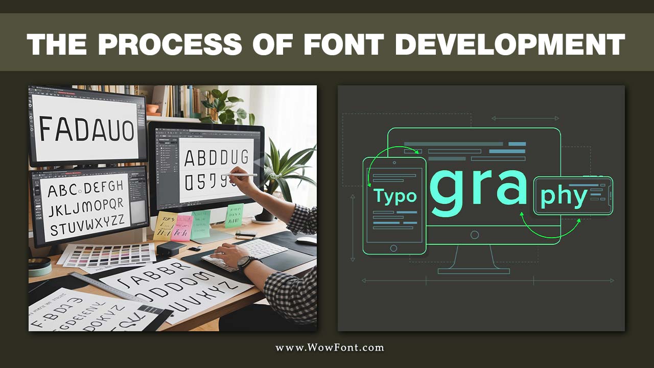
Understanding Font Development Basics
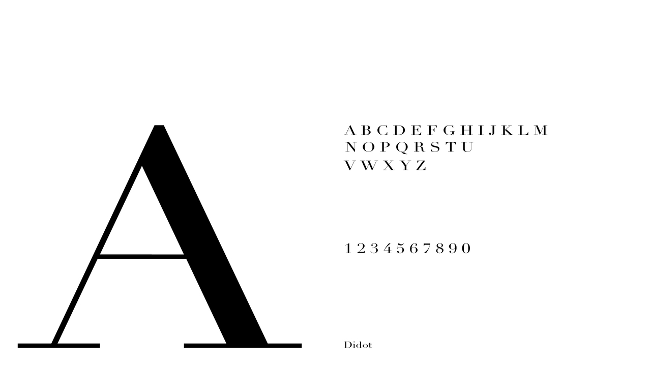
Understanding font development basics involves grasping key concepts that every graphic designer should know. Font weight affects the visual impact, influencing how text conveys meaning; for instance, bold weights are often used in display typefaces to grab attention.
Good typography hinges on the effective use of various font styles, including sans serif typefaces for clean readability and script typefaces for a personal touch. When creating a web font, it’s crucial to ensure compatibility across different platforms and browsers, maintaining design integrity. Ultimately, mastering these elements enables designers to craft cohesive and engaging visual communication that enhances user experience.
The Role Of Fonts In Design
Fonts are very important in graphic design. They affect how we see and interact with visual information. Fonts can create feelings, help shape brand identities, and improve the user experience. In today’s online world, where we read content on many different platforms, the right font makes it easy to read and nice to look at.
With social media and digital marketing growing, brands need unique and eye-catching fonts. These special typefaces help attract attention in a busy online space. For type designers, making a new font that fits current styles can be a fulfilling project.
Whether you choose a classic serif like Times New Roman for traditional print or a modern sans serif for a website, picking the right font can make a big difference in the overall design project.
Types Of Fonts: Serif, Sans Serif, And Beyond

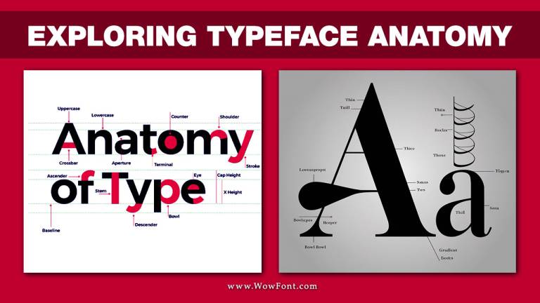
Fonts are grouped into different categories based on how they look. Two of the most common kinds are:
- Serif fonts: These fonts have small decorative lines at the ends of the letters. Serif typefaces, like Times New Roman and Garamond, are traditional, elegant, and classy.
- Sans serif fonts: These fonts do not have those decorative lines. Sans serif typefaces, such as Arial and Helvetica, have a modern, clean, and simple look.
There are also more types of fonts to explore:
- Slab serif
- Script Typeface
- Display Typeface
- Monospace
Each type of font has its own look and use. This adds more depth to the art of font creation.
Preparing For Font Creation
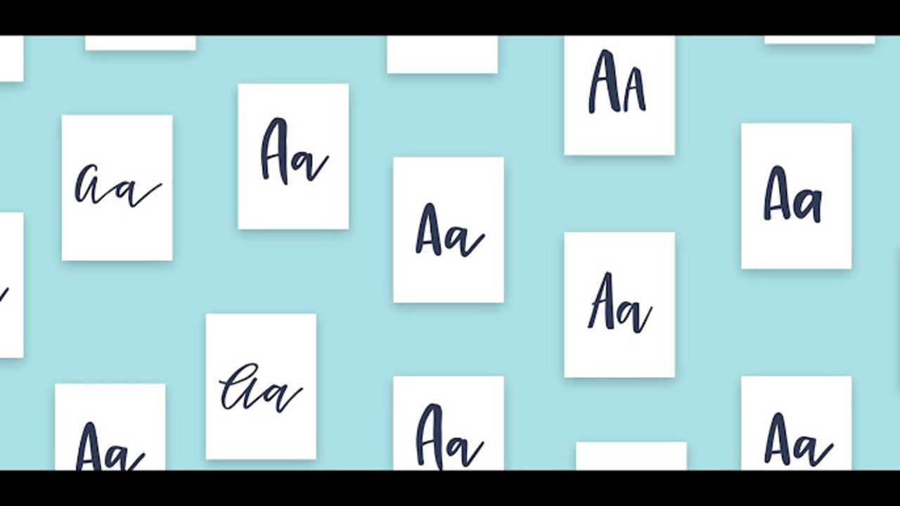
When you understand the basics well, it’s time to start your font creation journey. You need to get the right tools, find some inspiration, and set clear goals for your project.
Essential Tools And Software for Beginners
For beginners, many easy-to-use font editors help you start in the world of font design. Adobe Illustrator is a popular choice for graphic designers. It has basic features to create characters, also known as glyphs. But if you want better control over typography, you should look into dedicated font editor software like Font Forge, FontLab Studio and Glyphs Mini.
These programs have user-friendly designs, a range of tools, and great support for various font formats. FontLab Studio is complete and is often used in the industry. On the other hand, Glyphs Mini offers a simpler and cheaper option for beginners. If you want something free and flexible, try open-source programs like FontForge.
Always choose the software that fits your budget, skills, and UI design process.
Gathering Inspiration And Setting Objectives
Inspiration for your own font can come from many places. You might find ideas in old scripts, building styles, or things you see every day. Make mood boards, gather font samples, and look at typeface design trends. This will help shape the look of your project.
Think about what you want your font to do. Is it just for personal use, for certain projects, or do you want to sell it? This will help you make important design decisions.
Do you want a flexible font family like Helvetica, which can work well in many situations? Or do you want something unique that stands out? Write a detailed design brief to keep you on track.
Also, use social media to find inspiration. It can also help you connect with other designers and learn from them.
A Beginner’s Guide to Creating Your First Font
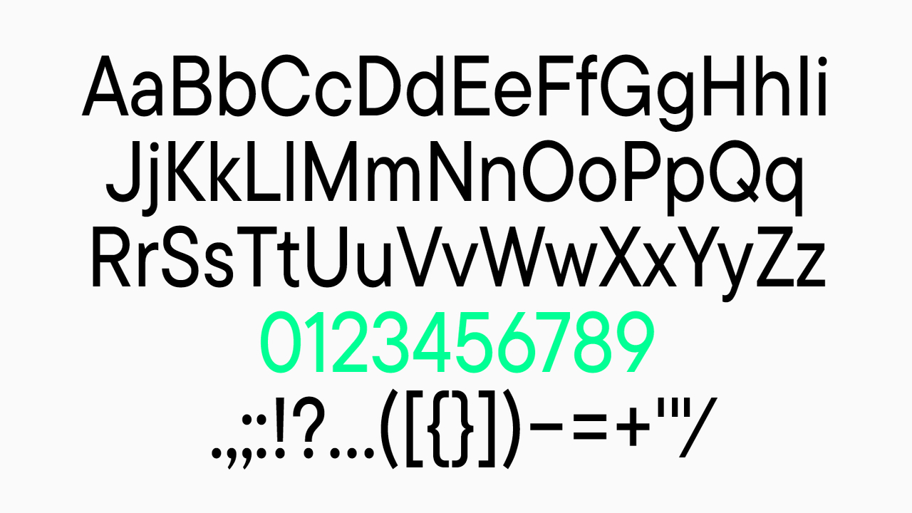
Creating your first font can be both fun and tough, especially if you are new to font creation. This simple guide will make it easier for you to start making your first typeface. Keep in mind, just like with any design work, you may face some setbacks. It’s important to learn from your mistakes and enjoy the creative journey.
Step 1: Sketching Your Concept
Before you start with digital design, begin your font design journey by sketching on paper. This helps you explore letter shapes and styles in a simple way. Use grid paper to keep your baseline and height consistent.
Start by designing the main character set. This includes both lowercase and uppercase letters, numbers, and important punctuation marks. Try using different pen tool strokes, weights, and styles until it looks right to you. Keep in mind that mistakes are okay, especially when you are sketching for the first time.
Many designers find that drawing on paper can boost creativity and help make their ideas clear.
Step 2: Digitalizing Your Sketches
Once you are happy with your sketches, it is time to turn them into digital design. You can scan your sketches or take clear photos. Then, import them into your preferred font editor. Use the software’s vector tools to trace over your sketches and create outlines. This will help you get smooth curves and straight lines.
At this step, you should carefully adjust the anchor points and handles. This is important to make sure your designs look just like your sketches. Being precise now is key because it will affect the final result of your first font. With patience and careful work, you will be close to having a good font file.
Step 3: Refining Character Design
Now that you have the basic character set digitized, it’s time to improve the individual shapes for better balance and style. Focus on letter spacing, stroke thickness, and the overall feel of your typeface. Make sure that any design decisions used for one letter are applied to others in the same style.
Look at your shapes from different views and zoom levels. This can help you spot mistakes and areas to fix. For instance, check how the lowercase “n” relates to “m,” or how “o” looks next to “c.” Finding these small gaps can change a good font into a great one.
This stage requires important design decisions that will shape how your font feels and how easy it is to read.
Step 4: Testing And Adjusting For Readability
A good font looks nice and is easy to read. When you have some of your letters finished, start testing your font in different situations. Write out paragraphs, titles, and even full pages using your nearly finished font.
Look at how your font works at different sizes and against different backgrounds. Pay close attention to letter spacing, word spacing, and line spacing. This helps make sure your font stays easy to read and good-looking in many places, like on screens or in printed form. You might need to change the space between certain letters, known as kerning. You can also make small changes to control characters to help get everything to fit well together.
Testing takes time, so don’t worry about making changes several times until your font is just right for good readability.
Advanced Techniques In Font Development
As you explore typeface design further, you will find advanced methods that can make your font outstanding. These methods aim to improve how the text looks and flows, making it easier to read. They also add polish to your designs. Using these methods can greatly improve the quality and professional look of your font.
Incorporating Ligatures And Special Characters
Ligatures join two or more letters into one symbol. They can make some letter combinations, like “fi” or “fl,” look better and easier to read. By adding ligatures to your font design, you can bring a touch of style and grace.
Special characters are important too. These include math symbols, money symbols, and accents. Having a wide range of these characters helps make a font more useful and flexible. It’s a good idea to include a complete set to support many languages and types of text.
A carefully made custom font, with well-designed ligatures and an extensive character set, shows that you pay attention to detail and care about quality in design.
Understanding And Applying Kerning
Kerning refers to adjusting the spacing between individual letter pairs to achieve a visually pleasing and harmonious flow of text. Proper kerning eliminates awkward gaps and ensures that letters appear evenly spaced, regardless of the letter combination.
While some font editors offer automatic kerning suggestions, achieving optimal results often requires manual adjustments. It’s a meticulous but essential step in typeface design. Neglecting kerning can make your font look unprofessional and hinder readability. Mastering this aspect of typeface design takes time and practice.
Here’s a basic example of how kerning adjustments are made:
| Letter Combination | Without Kerning | With Kerning |
| AV | A V | AV |
| To | To | To |
| Wa | Wa | Wa |
As you can see, even subtle kerning adjustments contribute significantly to the overall visual harmony and readability of text.
Conclusion
Digital font development is a detailed process that is important for good design. To make nice-looking text, you need to know the basics, different types of fonts, and the right tools. It does not matter if you are starting to draw your first idea or if you are learning advanced skills like ligatures and kerning; font creation takes both creativity and careful planning.
By using a clear method and improving your designs to be easy to read, you can create fonts that make your projects stand out. Explore font development with both love and patience, and show your creativity in every letter you create. If you are curious about font creation, begin your journey today!
Frequently Asked Questions
1.What Is The Best Software For Beginners In Font Design?
For beginners, FontLab Studio and Glyphs Mini are great options. FontLab Studio is detailed and shows what professionals use. Glyphs Mini has a simple design process and is a good price. If you want a free option, FontForge is a good pick.
2.How Long Does It Take To Develop A Font?
The time frame for making a first font can change a lot. It depends on how complex it is, the character set, and your design skills. Creating a simple font could take a few weeks. But bigger projects might need several months. In the end, it is the journey that matters, not just finishing it.
3.Can I Create A Font Without Prior Design Experience?
Sure! You don’t need design experience to create your own typeface. What you do need is a good eye for detail, a love for type design, and a desire to learn. Trust your visual instinct and be ready to try new things. That’s how you learn in the first place.
4.Are There Legal Considerations In Font Development?
Yes, legal matters are very important in font development. This is especially true for commercial font distribution. Fonts usually have copyright protection. Make sure you have the rights to any designs or elements from others that you use. When you share your fonts on sales platforms, learn their terms and rules.
5.How Can I Distribute My Finished Font?
Once you have chosen your font, you can share it through different channels. Online sites like MyFonts and FontSpring can help you reach more people for sales. Posting on social media can create interest and bring in a larger audience. Asking for feedback can give you useful tips and may help improve your MyFonts ratings. You might also think about making a website to display your work and build a unique online presence.
Leave a Comment