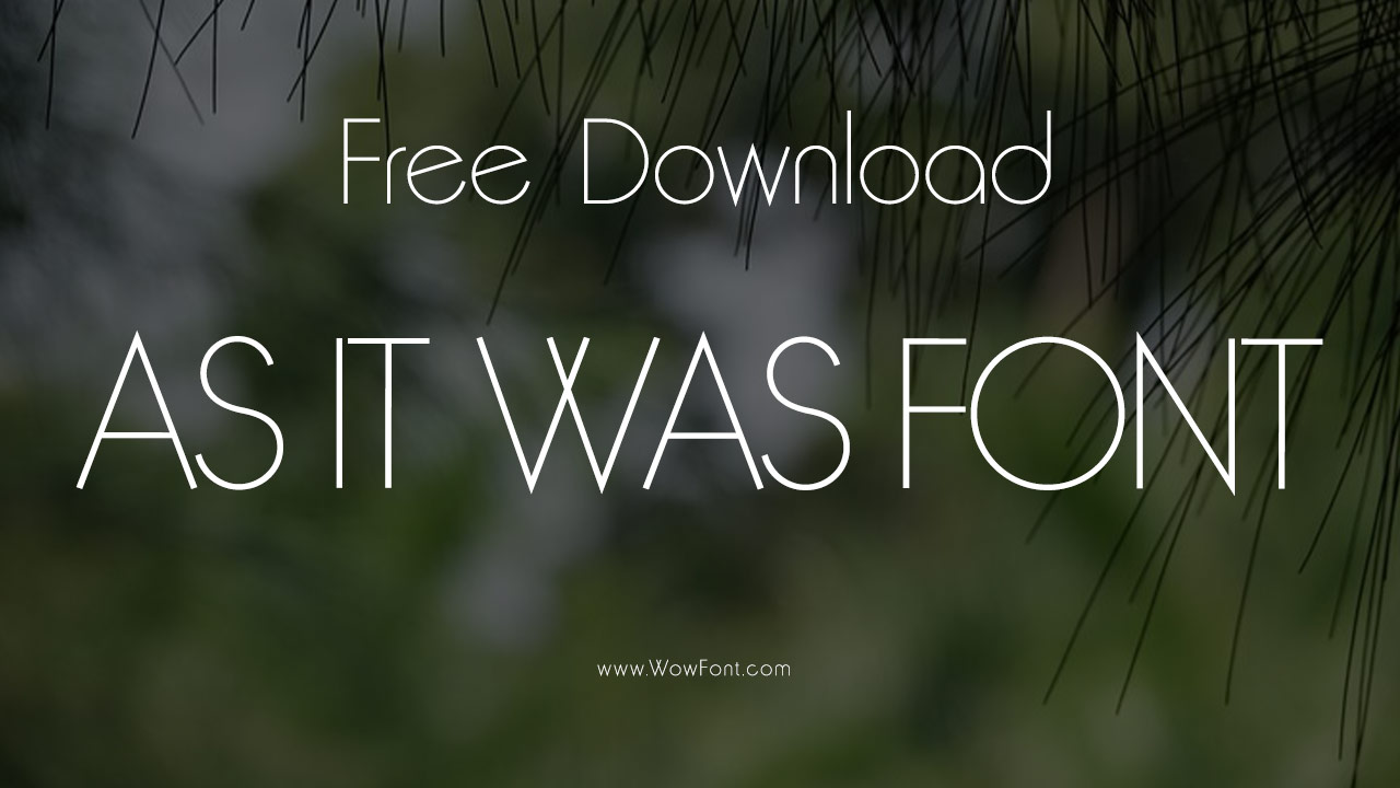
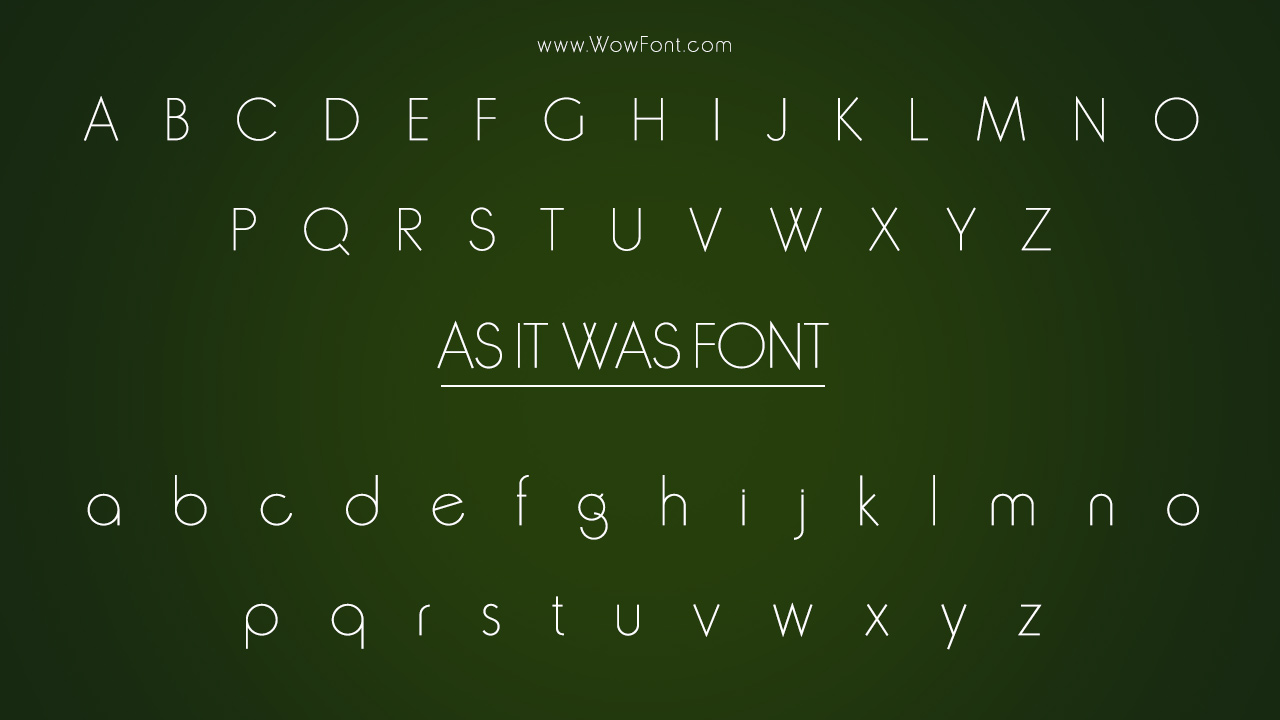
The “As It Was” font is a unique, elegant typeface. Featured in the artwork for Harry Styles’ hit single, They released the music album in 2022. The font used is Trooper Jazzerini Regular, created by the talented type designer David Trooper. It belongs to the Trooper Jazzerini family, which combines a clean, modern aesthetic with influences from classic avant-garde typography.
In this guide, we will delve into the specifics of the As It Was font, including its characteristics, font family, styles, and potential use cases. We’ll also explore the best font pairings, similar fonts, and where you can use it to create visually striking designs.

Font Overview: Trooper Jazzerini Regular
- Font Name: Trooper Jazzerini Regular
- Designer: David Trooper
- Style: Avant Garde-like geometric sans-serif
- Weights: Three weights, each with accompanying italics
- Aesthetic: The font exudes an elegant, modern feel with geometric shapes, soft curves, and minimalistic design. It’s bold yet refined, suitable for high-end visual designs, logos, album covers, and more.
Trooper Jazzerini Regular is popular for its unique balance of sharpness and smoothness, with each character boasting precise geometric elements. Its clean design offers a sense of sophistication, making it a standout choice for contemporary music and branding projects.

Where It’s Used
David Trooper created the Trooper Jazzerini Regular font, which is primarily used in the artwork for Harry Styles’ “As It Was.” Its use is currently exclusive to this artwork. The font also appears on David Trooper’s website, where it showcases its modern elegance. With its bold yet sleek presence, the typeface suits projects that require a high-contrast, sophisticated look.
Trooper Jazzerini has a unique style due to its sans serif construction, which makes it suitable for a variety of uses, both digital and print. The readable font structure allows for high legibility, making it perfect for body text or larger headings. Its font size flexibility means it can be handy in posters, social media graphics, and websites.
License And Availability
Trooper Jazzerini Regular is a premium font, meaning it is not available for free. To use it commercially or in your own projects, you will need to purchase a license. It can be obtained from the designer’s website or through other commercial font distributors. Interested users can purchase it directly from David Trooper’s website or through other font distributors that carry the typeface. It’s an exclusive font suitable for professional use, branding, and design.
Similar Fonts To Trooper Jazzerini Regular
If you’re looking for fonts with a similar feel to Trooper Jazzerini Regular, here are some excellent alternatives:
- Avant Garde: A classic, geometric sans-serif font with a similar elegant and modern look.
- Futura: Known for its clean, geometric design, Futura offers a similar vibe, often used in contemporary branding.
- Circular: A modern sans-serif font with rounded edges, creating a soft, approachable appearance while retaining geometric structure.
- Gotham Rounded: Offers a softer, rounded version of the geometric sans-serif style, creating a balanced, modern look.
Other Fonts You May Like
If you’re a fan of the As It Was font, here are some other fonts used in famous albums and designs that you might like:
- Lights Up Font: Featured in Harry Styles’ Lights Up single artwork.
- Fine Line Font: Used in Harry Styles’ Fine Line album artwork.
- Cruisin’ (Village People) Font: Retro typeface used for the Village People’s Cruisin’ album cover.
- Songs for the Deaf Font: Used in the artwork for Queens of the Stone Age’s Songs for the Deaf album.
- The Boat That Rocked Font: Used in the soundtrack album for the film The Boat That Rocked.
- Roxy Music Font: Featured on Roxy Music’s iconic album covers.
Conclusion
The As It Was font, Trooper Jazzerini Regular, is an elegant and modern sans serif font that offers excellent legibility and a sleek, geometric style. Whether you are designing album artwork, creating branding materials, or developing websites, this font adds sophistication and impact to any project.
While Trooper Jazzerini is a unique font created by David Trooper, you can experiment with similar fonts like Akzidenz Grotesk, Futura, or Adrian Frutiger to achieve a similar clean, modern aesthetic. Consider pairing it with other serif fonts or handwritten fonts for contrast, or keep it consistent with other sans serif fonts like Gill Sans or Century Gothic.
For the best results, ensure that your font choice aligns with your design’s purpose and tone. As a variable font, Trooper Jazzerini is flexible, allowing for dynamic adjustments across various applications.
FAQs
1.What Is The Name Of The Font Used In The “As It Was” Artwork?
The font used in the “As It Was” artwork is Trooper Jazzerini Regular, designed by David Trooper.
2.Where Can I Get The Trooper Jazzerini Font?
You can purchase the Trooper Jazzerini font from David Trooper’s website or other licensed font distributors.
3.What Are Some Similar Fonts To Trooper Jazzerini?
Some similar fonts include Akzidenz Grotesk, Futura, and Helvetica Neue, which share a geometric, sans-serif style.
4.Can I Use Trooper Jazzerini For Branding Or Commercial Projects?
Yes, but you need to purchase a font license to use Trooper Jazzerini Regular in commercial projects.
5.How Can I Pair Trooper Jazzerini With Other Fonts?
Pair it with classic serif fonts like Times New Roman or modern sans serif fonts like Gill Sans to create contrast and balance in your designs.


Leave a Comment