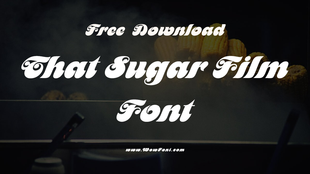
That Sugar Film is a 2014 Australian documentary directed by Damon Gameau that explores the hidden sugars in everyday foods and their impact on health.
Through an engaging personal experiment, Gameau shifts from a normal diet to a high-sugar diet equivalent to 40 teaspoons of sugar daily. This journey reveals how foods marketed as healthy, such as low-fat yogurt and fruit juices, often contain alarming amounts of added sugar.

Exploring The Font Used In That Sugar Film

The documentary not only highlights the dietary dangers but also serves as a wake-up call about the pervasive influence of the food industry. With a witty narrative delivered by Stephen Fry, the film invites viewers to reconsider their eating habits and be aware of the hidden sugars that can lurk in their favorite snacks and meals.
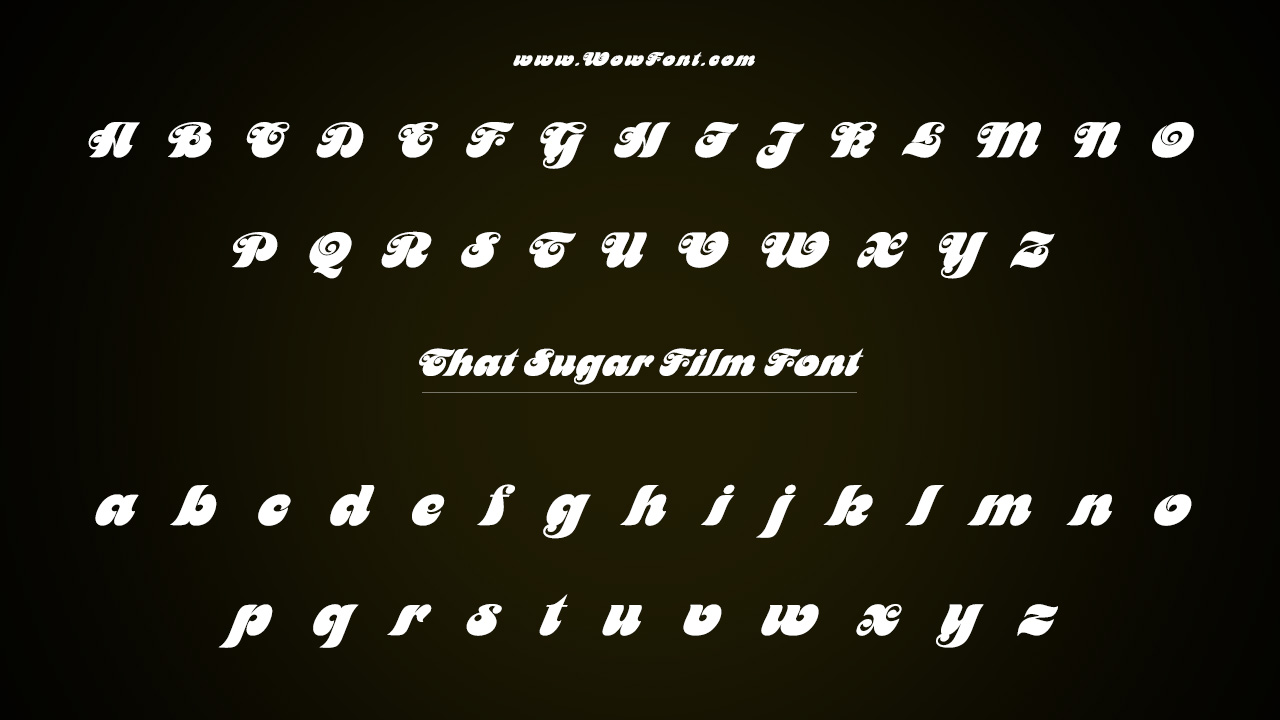
Just as the film delivers a powerful message about health, its visual presentation is equally significant. The title and promotional materials for That Sugar Film feature two distinct fonts: Motter Femina and Railroad Gothic.
Motter Femina
This font, designed by Motter Fonts, offers a playful yet elegant aesthetic, reflecting the film’s approachable style while addressing serious topics like sugar consumption. Its curvy, feminine qualities evoke a sense of creativity, making it perfect for food-related themes and health consciousness.
Railroad Gothic
Designed by ATF, this sans-serif font adds a bold, industrial edge to the film’s graphics. Its strong lines and structured appearance convey urgency and reliability, mirroring the documentary’s straightforward approach to unveiling the truth about sugar.
Where To Use These Fonts
Use Motter Femina for headers and Railroad Gothic for body text to create engaging flyers or social media graphics. Use the font in headings for a friendly vibe and Railroad Gothic for calls to action, especially in blogs focused on health and wellness.
Pairing Options
- Motter Femina pairs beautifully with modern sans-serif fonts like Helvetica or Futura, providing a balance of elegance and readability.
- Railroad Gothic works well with softer typefaces like Arial Rounded, adding a touch of warmth to its strong presence.
Similar Fonts
If you’re looking for alternatives, consider:
- Poppins: A geometric sans-serif that offers a clean and modern look.
- Avenir: A versatile sans-serif with a classic touch, suitable for various design applications.
Conclusion
The fonts used in That Sugar Film not only enhance the visual appeal of the documentary but also reflect its core message about health and awareness. By choosing Motter Femina and Railroad Gothic, the film effectively communicates the gravity of its subject while maintaining an accessible and engaging tone.
FAQs
1.What Is That Sugar Film About?
It examines the effects of hidden sugars in food through a personal diet experiment.
2.Which Fonts Are Featured In The Film’s Branding?
The film uses Motter Femina and Railroad Gothic for its promotional materials.
3.Where Can I Find These Fonts?
These fonts are available for purchase on various font distribution websites.
4.How Do The Fonts Reflect The Film’s Message?
Motter Femina adds a playful touch, while Railroad Gothic conveys urgency and reliability, mirroring the film’s tone.
5.Can I Use These Fonts For My Projects?
Yes, but check the licensing agreements for commercial use.


Leave a Comment